
Elementor Flexbox Containers: Beginner Guide (2026)
Quick answer: Flexbox containers are Elementor’s current layout system for asymmetrical rows and columns. A container can hold widgets and child containers, while its layout controls determine how those items flow, align, wrap, and share space.
Understand parent and child containers.
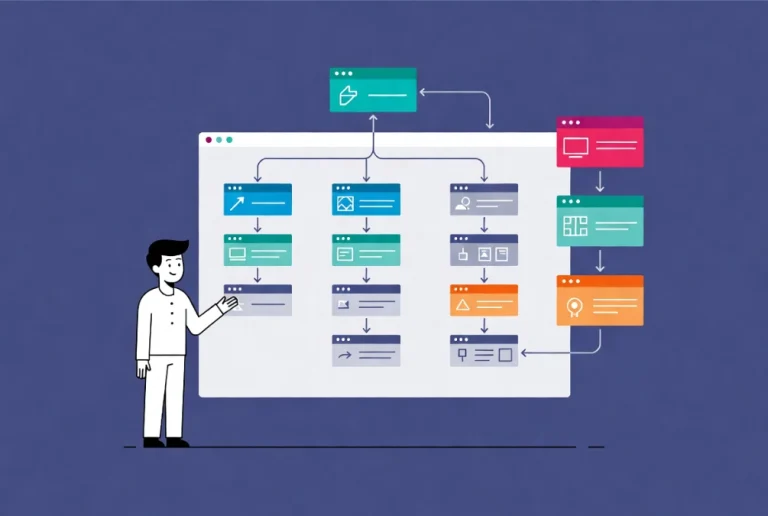
The selected parent controls the arrangement of its direct children. A row direction places children along a horizontal main axis; a column direction stacks them vertically. Nested containers are useful for grouping related widgets, but Elementor recommends building with as few containers as the design reasonably needs.
Create a simple container layout.
Select the plus sign on the canvas, choose Flexbox, and select a structure—or drag a Container element onto the canvas. Add widgets as direct children and create a nested container only when a group needs its own direction or alignment. Use Structure to confirm the hierarchy.
Use direction, justify, align, gap, and wrap.
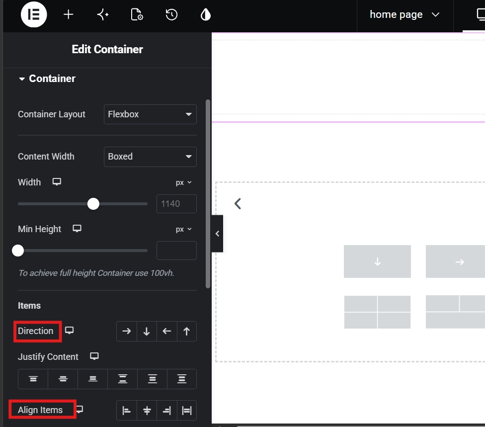
Direction defines the main axis. Justify Content distributes items along it, while Align Items controls the cross axis. Gap creates consistent spacing without per-widget margins. Wrap allows children to move to another line when space runs out. Test each change at several widths because the same values can behave differently as content grows.
Set size without causing overflow
Choose Boxed when the inner content needs a controlled width and Full Width when the container and its content should expand together. Use minimum height only when necessary. Large left or right margins on a full-width top-level container can create horizontal scrolling; inner padding or a boxed child is usually safer.
Build responsive and semantic containers.
Change direction or alignment at supported breakpoints instead of duplicating whole sections. Choose an appropriate HTML tag for meaningful regions, but do not select a tag merely for perceived SEO benefit. Continue with our containers vs. sections comparison and responsive Elementor guide.
Final quality check
- Preview the page on desktop, tablet, and a real phone
- Check keyboard navigation, visible focus, heading order, link wording, and color contrast.
- Test the live URL in a private browser window and clear caches if the editor and front end differ.
- Keep a backup before structural changes and confirm that forms, buttons, and links still work.
Official sources
- Elementor: What is a Flexbox Container?
- Elementor: Create a Flexbox container
- Elementor: Container size and behavior