
Elementor Containers vs Sections: Key Differences (2026)
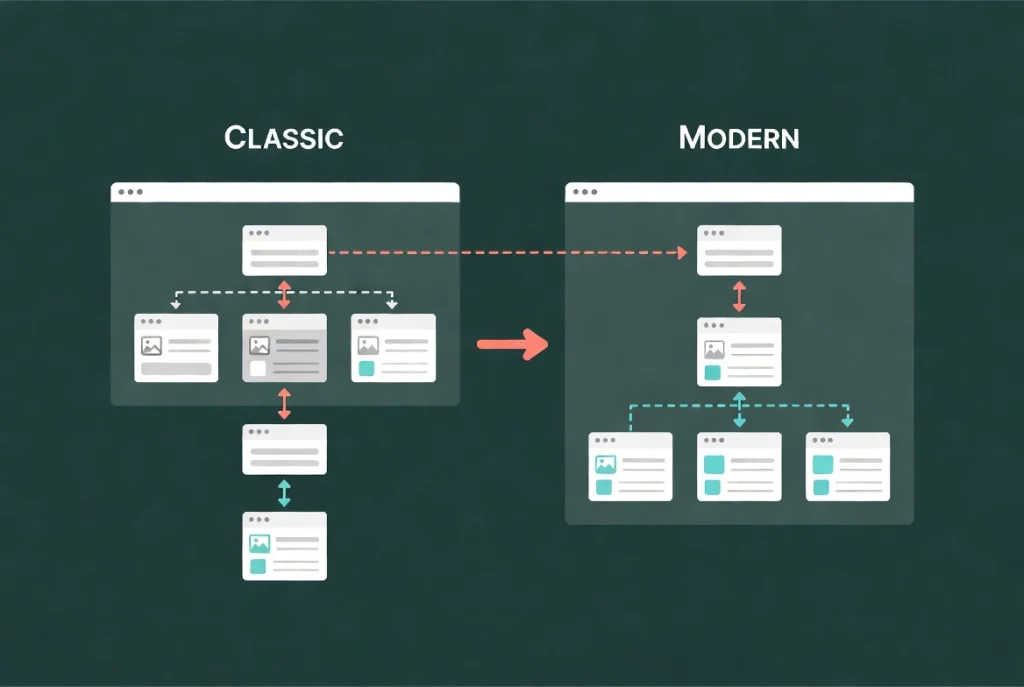
Elementor containers are the current layout system for new pages. Sections and columns are the legacy structure still found on older sites. Both can render working layouts, but containers provide Flexbox or Grid controls, can hold widgets and other containers, and usually need fewer wrapper elements.
Containers vs. sections at a glance
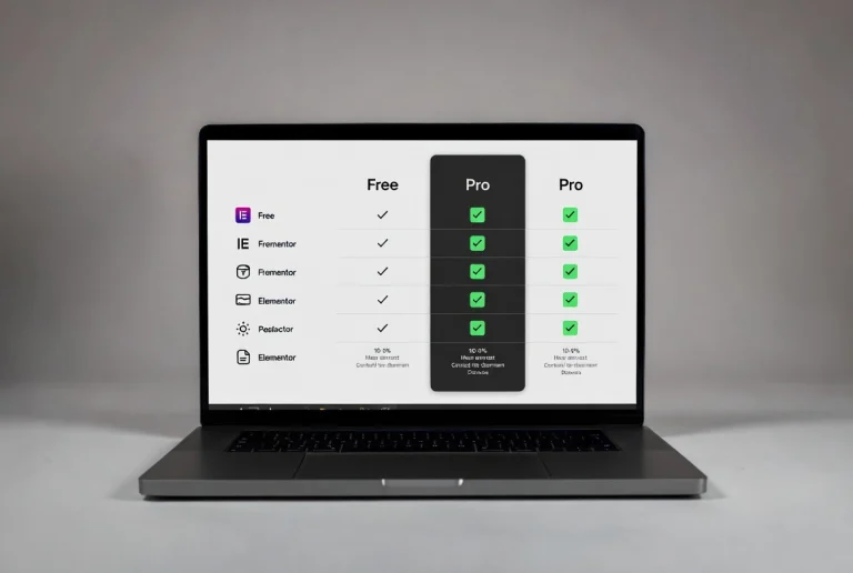
| Capability | Containers | Sections/columns |
|---|---|---|
| Current default for new layouts | Yes. | Legacy |
| Direction | Row, column, and reverse options | Section/column flow |
| Nesting | Containers can contain child containers. | Inner sections add another structural layer. |
| Wrapping and order | Flexbox controls | More constrained |
| Grid layouts | Dedicated Grid container | Column-based |
| Whole-wrapper link | The container can use an anchor tag. | Historically required another method |
How containers organize a page
A container can hold widgets and other containers. In a common hero, the parent controls overall width, direction, alignment, and gap. Two child containers group the text and image. Widgets remain the visible content units. Use the Structure window to confirm that each nesting level has a purpose; our Elementor Structure guide explains that audit.
Flexbox and Grid serve different layouts.
Use a Flexbox container for one-dimensional arrangement where items primarily flow in a row or column. Use Grid for a two-dimensional system of rows and columns, such as a regular card gallery. Do not choose Grid only because the design has three items; a wrapping Flexbox row may be simpler when card widths and counts change.
Why containers can reduce markup

Elementor states that a container uses one wrapper, whereas the section-and-column model uses more. A smaller DOM can improve rendering efficiency when the page is implemented well. This is not a guaranteed speed score: images, fonts, scripts, hosting, caching, and third-party widgets can outweigh the structural difference. Measure a representative page rather than repeating a universal percentage.
Responsive control and visual order
Containers can change direction, alignment, order, width, gap, and wrapping by breakpoint. That makes a desktop row easy to stack on mobile. Keep visual order consistent with meaningful DOM and keyboard order; using reversed direction for appearance can confuse reading order in some designs. Test keyboard navigation and assistive technology when order changes matter.
Should you convert old sections?
Do not convert a stable production page merely because containers are newer. Elementor warns that converting a section to a container is irreversible within that conversion workflow. Back up first, duplicate or stage the page, convert a representative section, and compare layout, responsive behavior, custom CSS, third-party widgets, and performance.
- Use containers for new layouts.
- Keep a stable legacy page until a conversion has a business or maintenance reason.
- Remove containers that add no grouping or layout behavior.
- Use gap and padding before adding spacer widgets or arbitrary child margins.
- Validate the result at real widths and on the public page.
A safe conversion workflow
- Back up the database and files and capture screenshots at important widths.
- Clone the page or site to staging.
- Inventory custom CSS, add-on widgets, absolute positioning, and responsive visibility.
- Convert one representative section and inspect the structure and rendered HTML.
- Compare desktop, tablet, mobile, keyboard order, and interactive behavior.
- Measure the same URLs and conditions before and after; do not attribute every score change to containers.
Common container mistakes
Nested containers are not inherently wrong; unnecessary nesting is. Avoid using a child container only to add space, setting large fixed heights around variable text, hiding overflow that makes content inaccessible, and making a whole container clickable when it contains other interactive controls. Choose semantic HTML tags deliberately and verify that a linked card has one clear accessible destination.
If a layout develops horizontal scrolling, inspect fixed widths, viewport units, negative margins, transforms, and children that refuse to shrink. Hiding overflow can conceal the symptom while cutting off focus indicators or content, so correct the sizing cause first. For spacing choices, use our Divider and Spacer guide.
Elementor’s official containers-versus-sections comparison and container layout reference document these controls. For a practical build, follow our Elementor Flexbox container guide.