How to Create Your First Elementor Page (2026)
Your first Elementor page should teach the complete workflow: Create a WordPress draft, open the Elementor Editor, build a shallow container layout, add semantic content, apply global design values, test responsive behavior, and preview the real result before publishing.
Plan a simple page before opening Elementor.
Use a small service-style page with a hero, benefits, proof, and one call to action. Write the heading and body copy first. Collect one properly licensed image, decide the destination of the button, and identify the page’s primary reader. This prevents the template or available widgets from dictating the message.
1. Create a WordPress draft.
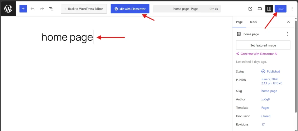
- Go to Pages → Add a New Page.
- Enter a descriptive page title and save the draft.
- Review the permalink and page template.
- Select Edit with Elementor.
If the Elementor button is unavailable, confirm that the plugin is active and that Pages is enabled in the Elementor settings. Follow our Elementor installation guide before troubleshooting the editor.
2. Understand the editor
The editor consists of a top bar, a panel, and a canvas. The panel contains layout elements and widgets or the settings for a selected item. The canvas is the page. The top bar provides site settings, responsive views, structure, preview, and publish/update controls. See the Elementor interface tour for a detailed map.
3. Build the page with containers.
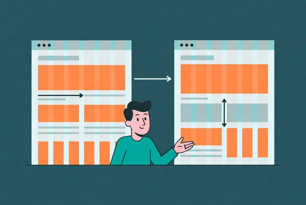
Select the plus control and choose a Flexbox container. For a hero with text beside an image, use one parent container in the row direction with two child containers. Put the heading, paragraph, and button in one child and the image in the other. On mobile, switch the parent to Column or Column Reverse if the reading order requires it.
Use the container gap control between children and padding inside the section. Avoid repeated empty containers and Spacer widgets. Name the parent “Hero” and its children “Hero content” and “Hero image” in the structure so the hierarchy remains clear.
4. Add content widgets
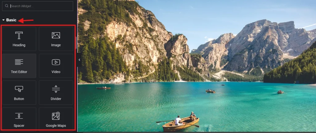
- Heading: use a meaningful heading level, with one primary H1 for the page.
- Text Editor: Write concise, scannable copy and use meaningful links.
- Image: Choose an appropriately sized file and add accurate alt text when informative.
- Button: label the action clearly and verify its destination.
5. Apply global design settings
Set shared fonts, colors, content width, and spacing in Site Settings before creating many local overrides. Use a limited palette and readable typography. A global token makes later changes predictable; a one-off widget value is appropriate only for a genuine exception.
6. Make the layout responsive.
Use desktop, tablet, and mobile views in the top bar. Responsive changes often cascade from wider to narrower devices, so work from large screens toward small screens and override only what needs to differ. Check container direction, widths, padding, gaps, typography, image crops, and button sizing. Then test real browser widths; the editor preview is an aid, not device testing.
7. Preview and publish safely
- Preview the page and read it from top to bottom.
- Test every link, button, form, and interactive control.
- Check keyboard navigation, focus, contrast, and image alternatives.
- Review page title, URL, featured image, and SEO fields.
- Publish, then test the canonical URL in a logged-out private window.
Common first-page problems
The page has an unwanted header, footer, or title.
Review page settings and the selected template. Default or Theme uses the theme’s page structure; Full Width keeps the header and footer while widening the content; Canvas removes the normal header and footer. Hide Title affects the page title but does not replace a careful heading plan.
The mobile layout items are in the wrong order.
Select the parent container and review the direction and item order at the mobile breakpoint. Prefer a logical source order and use reverse controls carefully, as a visual order that differs from the keyboard or reading order can confuse users.
The editor looks correct, but the public page does not.
Save the page, test the canonical URL logged out, and inspect theme rules, generated CSS, plugin optimization, and cache layers. Change one variable at a time. Rebuilding the entire section usually fails to identify the underlying conflict.
Elementor’s current first-page documentation confirms that containers replace the older sections-and-columns workflow. Keep this first page intentionally simple, then use our preview and publishing checklist: a clean structure, real content, accessible controls, and repeatable QA are a stronger foundation than a large collection of effects.