Elementor Typography: Text and Global Fonts Guide (2026)
Effective Elementor typography starts with a system, not with styling every heading independently. Define a readable body style and a small heading scale, apply them globally, keep semantic heading levels separate from visual size, and test the result across real screen widths.
Heading widget vs. text editor
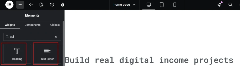
Use the Heading widget for the page title and section headings. Choose the HTML level from the meaning: H1 for the primary page heading, H2 for major sections, and H3 for subsections. Do not select H4 because its default appearance looks smaller; change the visual style without breaking the hierarchy. Use the Text Editor for paragraphs, lists, and inline links.
Create a global typography system.
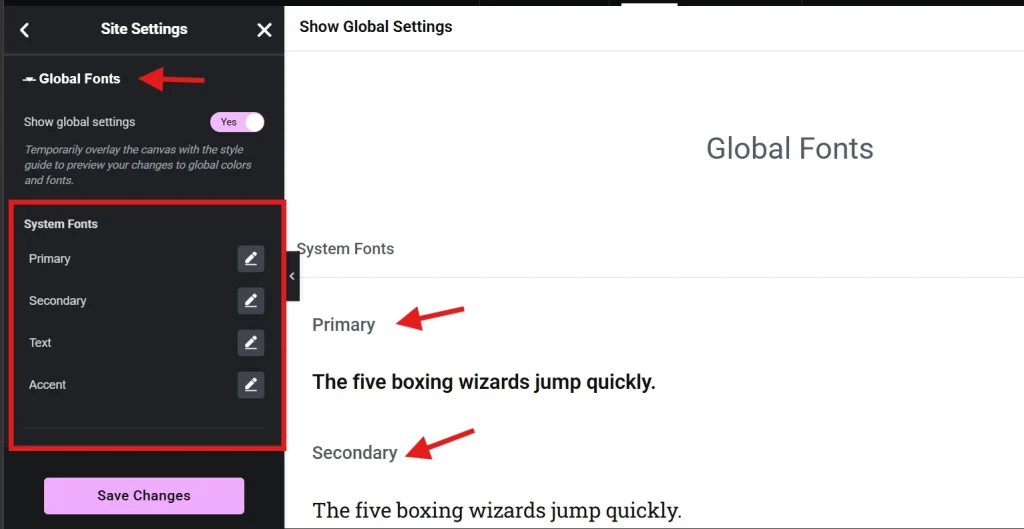
Open Elementor’s global font settings from WP Admin or Site Settings and define styles by role: body, small text, primary heading, secondary heading, and any intentional accent. Use names that describe purpose rather than a specific font name. If the brand changes later, a role such as “Body” remains meaningful.
- Limit font families and loaded weights to those the design uses.
- Choose a body size and line height that remain comfortable on mobile.
- Build a heading scale with visible but not extreme differences.
- Set link and focus styles that remain identifiable without relying on color alone.
- Use local widget overrides only for documented exceptions.
Our Elementor global fonts guide covers the shared design workflow in more detail.
Edit an individual text style.
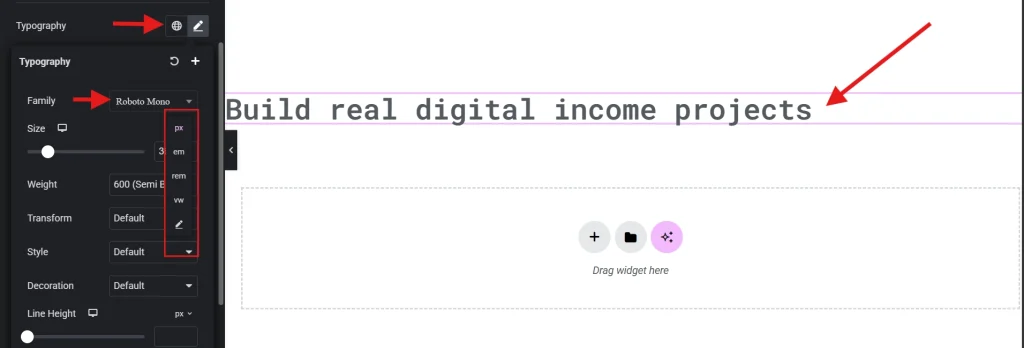
Select a text widget, open Style, and expand Typography. Apply a global value when one fits. Otherwise, adjust only the property that requires an exception. Avoid fixed heights around text; translations, browser zoom, and user font settings can increase its size. Verify that longer headings wrap without overlapping nearby elements.
Use responsive typography carefully.
Many typography controls can differ by breakpoint. Start with the wide-screen system, move to tablet and mobile, and reduce only values that create a real problem. Do not make body copy tiny just to preserve a desktop composition. Test at 200% browser zoom, narrow widths, and with realistic long text. Responsive editing is top-down in classic Elementor: A tablet change can flow to mobile until overridden. See our responsive design guide.
Choose hosted fonts deliberately.
External font services introduce network and privacy considerations. Locally hosted fonts require licensing, correct file formats, caching, and preload decisions. Elementor Pro supports custom fonts; current versions also support variable fonts with defined width and weight axes. A variable file can replace several static files in some families, but it is not automatically smaller—compare real files and browser output.
Accessibility checks for text
- Keep body text readable and allow browser zoom without clipping.
- Verify contrast for normal, hover, visited, and focus states.
- Avoid justified body copy that creates irregular spacing.
- Do not place essential text inside an image.
- Keep line length reasonable with a content-width constraint.
- Use real lists and headings instead of manually styled paragraphs.
Troubleshoot inconsistent fonts.
Verify whether the widget uses a global value or a local override, whether the theme competes with Elementor defaults, and whether the requested font file loads successfully. Elementor documents that theme styles and widget styles interact with its default font settings. After a deliberate configuration change, clear generated files and relevant caches; do not repeatedly purge everything without identifying the source.
Final typography checklist
Typography questions
How many fonts should an Elementor site use?
There is no mandatory number, but one family with a clear weight range or two complementary families is often enough. Every additional family and weight adds design and loading complexity. Add one only when it has a defined role.
Should headings use pixels, rem, em, or fluid values?
Choose units that fit the site’s accessibility and design system, then test browser zoom and breakpoint behavior. Relative units can support scalable systems, while uncontrolled viewport formulas can become too small or large. The result matters more than declaring one unit universally correct.
Why does a font flash or shift during loading?
The browser may initially render a fallback while the web font downloads. Review font hosting, file size, preload decisions, cache headers, and the fallback stack. Optimize the critical families instead of preloading every file, which can compete with other page resources.
Confirm one H1, logical heading levels, global roles, limited families and weights, readable body text, responsive wrapping, contrast, keyboard focus, and successful font loading. Elementor’s current global-font documentation and variable-font guide provide the live interface details. Apply the complete release process from our Elementor best-practices guide. A consistent system is easier to read, faster to revise, and less fragile than dozens of unrelated widget settings.