
How to Create a Custom Button in Elementor (2026 Guide)
You can create a custom button in Elementor with the core Button widget—no custom code is required for most designs. The important work is not adding a rectangle to the page. It is choosing a clear action, configuring the correct destination, linking the style to your design system, and testing the button with keyboard, touch, and different screen sizes.
This tutorial follows the current Elementor Button widget documentation and WCAG 2.2 guidance verified on September 10, 2026. It covers the standard Elementor editor; labels may vary slightly in Elementor 4 atomic workflows.
Custom Elementor Button at a Glance
- Add the Button widget and write a specific action label.
- Enter and test the destination before styling.
- Use global colors and typography for repeatable brand styling.
- Design normal, hover, and keyboard-focus states with adequate contrast.
- Make the target large enough and leave space from nearby controls.
- Test the button logged out on mobile and with a keyboard before publishing.
1. Define the Button’s Job
Decide what should happen after activation. Common actions include opening a product page, moving to a pricing section, downloading a file, submitting a form, or starting checkout. One button should communicate one primary action.
Use a label that describes the result: “View pricing,” “Download the checklist,” or “Start the free trial.” Avoid generic labels such as “Click here” when the surrounding context does not make the destination obvious. Clear link text helps all readers and makes lists of links understandable to screen-reader users.
2. Add and Configure the Elementor Button Widget
Open the page in Elementor, locate the Button widget, and drag or click it into the intended container. The official Elementor Button widget guide documents the available content, style, and advanced controls.
- In the Content tab, enter the button text.
- Paste or select the destination in the Link field.
- Add an icon only if it clarifies the action.
- Choose whether the icon appears before or after the label and adjust its spacing.
- Set alignment relative to the containing layout.
Test the URL immediately. Internal links should use the canonical HTTPS address or Elementor’s dynamic-link option where appropriate. For a file download, confirm the file exists, the visitor has permission to access it, and the file type is clearly communicated.
3. Configure Link Options Correctly
The link settings can open a destination in a new window and add a link relationship. Do not add nofollow to every external button. Google says ordinary editorial links need no special rel value. Use rel="sponsored" for advertisements, affiliate links, and paid placements; it nofollow remains acceptable when sponsored is unavailable. User-generated links can be used.
See Google Search Central’s outbound-link qualification guide for the current rules. Link attributes describe your relationship with the destination; they are not a general tool for improving a page’s SEO score.
Open a new window only when it benefits the user, such as preserving progress in a long form while opening supporting information. Unexpected new tabs can be confusing. If a button opens a new tab or downloads a file, make that behavior clear in the label or nearby text.
4. Use a Button ID Only When Needed
Elementor includes an optional Button ID field for cases such as analytics events, scripts, or same-page anchors. An ID must be unique within the rendered page. Use a stable, descriptive value such as download-security-checklist, without spaces.
Do not add an ID to every button without a purpose. Duplicate IDs can break scripts and create invalid markup. For analytics, define the event name, consent requirements, and reporting goal before adding the tracking code.
5. Style the Button
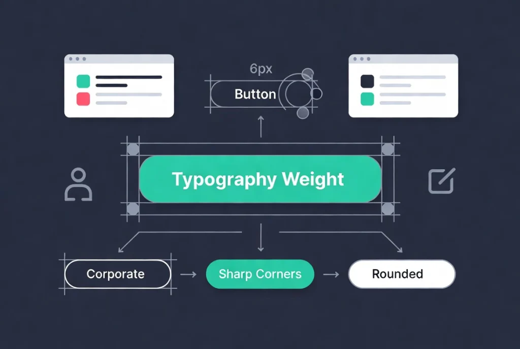
Open the Style tab to adjust typography, text color, background, border, radius, shadow, padding, and hover behavior. There is no universal padding ratio, radius, font weight, or shadow that fits every brand. Start from your design system and test the result in context.
Link reusable values to the design system.
Choose Global Colors and Global Fonts through Elementor’s global selector when the button uses a recurring brand style. This makes future changes easier and avoids slightly different colors or typography across pages. Our Elementor Global Colors and Fonts guide explains the complete setup.
Set padding and width for the content.
Padding creates the active area around the label. Use enough vertical and horizontal space to make the control easy to activate without making it dominate the layout. A full-width button can work well on narrow screens, but it is not required for every mobile design. Check how long translated labels and increased text size affect the button.
Use borders, radius, and shadows consistently.
Match the site’s component language. If cards and form fields use a modest radius, a dramatically different pill button may look unrelated. Shadows should not be the only cue that an element is interactive, and an outlined button still needs enough contrast against its background.
6. Design Hover, Focus, and Active States
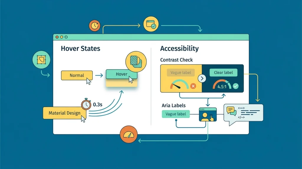
Elementor lets you set normal and hover colors, a hover animation, and transition duration. Keep motion subtle and avoid movement that makes the target difficult to activate. Hover is unavailable on many touch devices, so the default state must already look interactive.
Keyboard focus is separate from hover. WCAG 2.2 requires a visible focus indicator for keyboard-operable controls. Do not remove the browser outline unless you replace it with an equally clear :focus-visible style. Check the button by pressing Tab through the page and activating it with Enter.
Custom focus styling may require site-level CSS, depending on the Elementor version and widget. When adding CSS, use a class that targets the button and test normal, hover, focus, visited, and disabled-looking states. Avoid overly broad selectors that alter every link.
7. Check Contrast, Name, and Target Size
WCAG 2.2 Level AA requires at least 4.5:1 contrast for normal text and 3:1 for qualifying large text, with defined exceptions. Test button text against the background in both normal and hover states. The button boundary and focus indicator may also need sufficient non-text contrast.
For target size, WCAG 2.2 Success Criterion 2.5.8 generally requires a target that can contain a 24 × 24 CSS-pixel square or adequate spacing under its specified exceptions. That is a conformance minimum, not necessarily the best mobile experience. Larger targets are often easier to use, especially near other controls.
- Use meaningful visible text whenever possible.
- If an icon is the only visible content, provide an accessible name.
- Do not repeat the word “button” unnecessarily in an ARIA label.
- Ensure the label and accessible name describe the same action.
- Leave enough distance from nearby links and controls.
Elementor Pro supports custom attributes on widget wrappers. Add ARIA only when native visible text does not already provide the required name or state, and inspect the rendered HTML to confirm the attribute lands on the intended element.
8. Make the Button Responsive
Use Elementor’s responsive preview to review desktop, tablet, and mobile, then verify on real devices. Do not assume one fixed height or font size is correct for every breakpoint.
- Confirm that the complete label fits without clipping or awkward wrapping.
- The target size and spacing with adjacent controls.
- Test portrait and landscape orientation.
- Increase text size or browser zoom and confirm the button remains usable.
- Verify that sticky headers, cookie banners, and popups do not cover the button.
9. Reuse the Style Instead of Rebuilding It
Configure the site’s default button appearance under Elementor Site Settings and use global colors and typography for recurring values. Create a deliberate secondary variation when the design needs both primary and secondary calls to action.
Avoid copying a styled widget across dozens of pages as the only reuse strategy. Copies can drift after local edits. Global values, theme styles, classes in Elementor 4, and reusable components provide clearer maintenance paths.
10. Add Custom CSS Only for a Defined Need
The standard widget controls cover most button designs. Use custom CSS when you need a focus treatment, design-system behavior, or effect that the interface cannot express. Assign a meaningful class rather than relying on a generated selector.
Keep CSS in a documented site-level or child-theme location when it should apply broadly. Test reduced-motion preferences if you add animation. Avoid effects that reduce contrast, cause layout shifts, hide focus, or make the active area differ from the visible button.
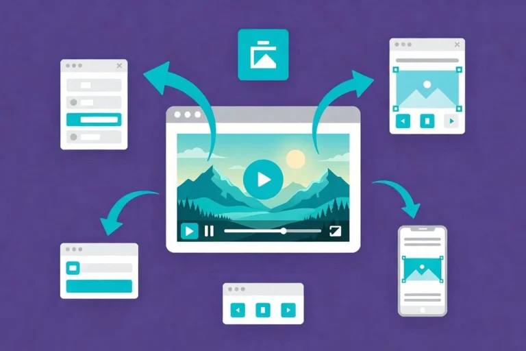
Elementor Button Video Walkthrough
The following video demonstrates the editor workflow. Interface details may differ from the current Elementor version, so use the official Button widget documentation for current labels and options.
Pre-Publish Button Testing Checklist
- The visible label clearly describes the result.
- The URL, file, form, popup, or anchor works for logged-out visitors.
- Paid or affiliate destinations use the appropriate link qualification.
- Normal, hover, and focus states remain readable.
- Keyboard focus is visible, and Enter activates the link.
- The target and surrounding spacing work with touch input.
- The label survives translation, zoom, and narrow screens.
- Analytics fires only after required consent and does not duplicate events.
Bottom Line
A well-designed custom Elementor button has a clear label, correct destination, reusable styling, adequate contrast, visible keyboard focus, and a practical touch target. Elementor provides the controls; the qualidepends on how consistently and accessibly you use themsed.
Start with the standard Button widget and global design values. Add tracking, attributes, new-window behavior, or custom CSS only when the interaction genuinely requires them, then test the rendered page before publishing.