
A designer I admired early in my career had a rule she applied to every page before sending it to a client: “If it feels crowded, it is crowded.” She would open the finished design, squint at the screen, and immediately identify every section where the content felt rushed or compressed. Her fix was never to remove content. She simply added space. Sometimes a 30px gap between a headline and a paragraph transformed a section that felt dense and hard to read into one that felt clear and inviting. That lesson took me years to fully internalize, and the Elementor Divider and Spacer widgets are where it plays out in practice on every build. These two widgets look simple on the surface. Used with intention, they are among the most powerful layout tools Elementor offers. This guide covers both widgets from configuration through strategic application, including the responsive adjustments and common mistakes that separate professional results from amateur ones. If the Elementor editor is still new territory, the Getting Started with Elementor guide covers the interface foundation first. For the WordPress layer beneath everything here, the WordPress basics and installation guide is where that foundation starts.
⚡ Quick Summary (TL;DR)
- Blank space acts as an intentional layout element rather than empty real estate when designing clear, inviting websites.
- The invisible Elementor Spacer widget creates consistent vertical rhythm by adding precise pixel or fluid viewport height between content blocks.
- The highly customizable Elementor Divider widget provides structural boundaries with options for solid, dashed, or dotted horizontal lines.
- Incorporating icons or text labels into a divider turns a basic horizontal separator into a helpful content cue for long-form layouts.
- Reviewing responsive adjustments at every mobile breakpoint prevents excessive vertical gaps from ruining the smartphone user experience.
Why Whitespace Is a Design Element, Not an Absence of One
Content density is one of the most common mistakes in web design. Packing too much information into too little space triggers cognitive overload, where visitors struggle to process what they are looking at and give up before they find what they need. Research from the Nielsen Norman Group on web scanning behavior shows that users make the decision to stay or leave within a few seconds of landing on a page. Visual structure directly shapes that first impression. Pages that feel crowded signal effort. Pages that breathe signal clarity. The Spacer and Divider widgets are the primary tools for creating that breathing room inside Elementor.
The Elementor Spacer Widget: Invisible and Essential
The Spacer widget inserts vertical blank space between elements. No line, no graphic, no visual treatment of any kind. Just empty pixels that give surrounding content room to exist without competing for attention. Its function is singular, and that singularity is what makes it so effective.
Configuring the Spacer: Height and Units
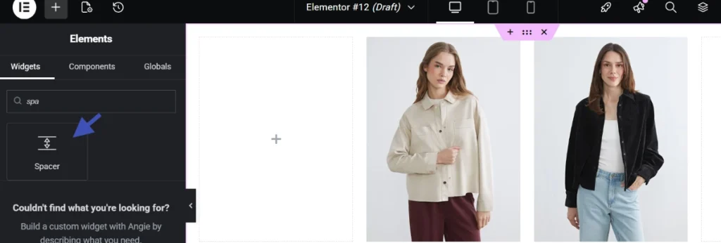
The Height setting in the Content tab is the only configuration the Spacer requires. Pixels provide predictable, fixed vertical separation that works consistently across screen sizes. Viewport units like vw and vh create fluid spacing that scales proportionally with the screen. A 5vw spacer produces a gap equal to 5 percent of the viewport width, which means it automatically adjusts at every screen size without requiring separate breakpoint settings.
Fixed pixel values are the more common choice for most Elementor builds because they produce consistent, predictable results that match a spacing scale. Establishing that scale before building any page, using increments of 10px or 20px, keeps vertical rhythm consistent across the entire site. A 20px spacer between body copy and a subheading, a 40px spacer between sections, and an 80px spacer after a hero area creates a hierarchy of breathing room that visitors feel even when they cannot name it.
Responsive Spacer Adjustments Are Not Optional
A 60px spacer that looks balanced on a desktop monitor consumes a significant portion of a mobile screen’s vertical real estate. Elementor’s responsive controls let the Spacer height be set independently at desktop, tablet, and mobile breakpoints. Reducing the spacer to 30px or 20px at the mobile breakpoint maintains visual separation without wasting the limited screen space that mobile visitors have available. Always switch through every breakpoint in the Elementor editor and adjust spacer values before publishing any page. What looks correct on desktop rarely translates without adjustment.
The Elementor Divider Widget: Visible Structure with Precision
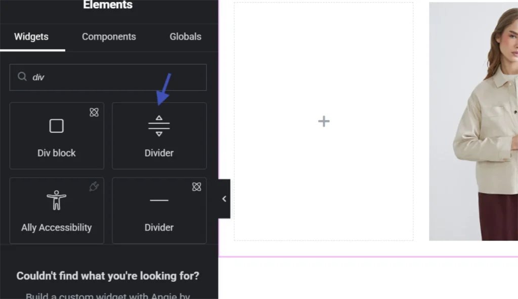
Where the Spacer creates invisible separation, the Divider creates a visible boundary. It draws a horizontal line that tells the visitor explicitly: one content block ends here and another begins. That visual cue carries real structural meaning. Visitors process it instinctively without needing to read anything.
Divider Configuration Options
Width controls the horizontal extent of the line. Full width creates a complete section break. Narrower widths centered on the page create a more subtle decorative separator that signals transition without dominating the layout. Alignment positions the divider to the left, center, or right when the width is less than 100 percent.
Style offers five line types: Solid, Double, Dotted, Dashed, and Groove. Solid works for most contexts and carries the clearest structural meaning. Dashed and Dotted create lighter visual weight that suits separating items within a section rather than between major sections. Weight, measured in pixels, controls line thickness. A 1px line provides a subtle, elegant division. Three to five pixels creates a more pronounced break that works for major section transitions. Color should almost always come from the global palette. A light grey or a desaturated version of the brand’s primary color keeps the divider functional without pulling visual attention away from the content it separates.
Adding Icons or Text to the Divider
The Divider widget supports adding an icon or a short text label at its center. This transforms a purely structural element into a content cue. A divider with the text “Key Takeaways” or a small arrow icon introduces the following section with context before the visitor reads a word of it. Long-form content like detailed tutorials and product descriptions benefits from this treatment because it creates visual anchors that help visitors navigate without a table of contents. The guide on Understanding Elementor Sections, Columns, and Widgets covers how dividers integrate with the broader structural hierarchy of an Elementor page.
Using Spacers and Dividers Together for Professional Page Rhythm
The two widgets work best in combination rather than in isolation. A Spacer manages the vertical rhythm between elements within a section. A Divider signals the transition between major content blocks. Used together, they create a layered spacing system that communicates hierarchy without any explicit labeling.
A practical example: after a hero section, an 80px Spacer provides generous breathing room before a subtle 1px solid grey Divider signals the end of the hero context. Another 40px Spacer then precedes the first content section below it. That sequence gives the page three distinct levels of separation: the hero space, the transition signal, and the content introduction gap. Visitors experience the page as organized and intentional without consciously identifying why.
Contact forms benefit from the same approach. Consistent Spacer gaps between input fields prevent the form from appearing cramped. A Divider between the final input field and the submit button creates a clear visual pause before the primary action, which reduces the sense that the form is demanding something immediately. For a full walkthrough of contact form construction in Elementor, the guide on Adding a Contact Form to Your Elementor Page covers every configuration step in detail.
Comparing Spacer and Divider Use Cases
| Situation | Use Spacer | Use Divider |
|---|---|---|
| Between body text and a CTA button | Yes | Rarely |
| Between two major page sections | Yes, for breathing room | Yes, for a visible boundary |
| Between form fields | Yes | No |
| Before a new article on an archive page | Yes | Yes, to signal a new entry |
| Inside long-form tutorial content | Yes, between steps | Yes, with text label for anchoring |
Common Mistakes That Undermine Both Widgets
Inconsistent spacer heights across a page create visual dissonance that visitors register as unprofessional without identifying the specific cause. Establishing a spacing scale before building and sticking to it eliminates that problem entirely. Multiples of 10px or 20px work well as the base increment for most builds.
Overusing dividers is the second most common mistake. A page with a horizontal line every few paragraphs looks cluttered and reminiscent of early web design conventions that modern visitors associate with outdated sites. Dividers should appear at major content transitions, not between every block of text. When in doubt, a spacer alone usually handles the separation more cleanly.
Ignoring responsive adjustments on both widgets creates layouts that work on desktop and break on mobile. Every spacer and divider on every page needs breakpoint-specific values reviewed before publishing. Using purely decorative dividers without a structural purpose adds visual noise without serving the visitor. Every instance of either widget should answer the question: what does this help the visitor understand or navigate?
Additional Resources
- WordPress Basics and Installation: The Complete Beginner’s Guide
- Getting Started with Elementor in 2026: The Complete Guide
- Understanding Elementor Sections, Columns, and Widgets
- Adding a Contact Form to Your Elementor Page
- Responsive Design Basics: Making Elementor Sites Mobile-Friendly
- How to Use Elementor Flexbox Containers: A Beginner’s Guide
- Setting Up Global Colors and Fonts in Elementor
- Elementor Free vs Pro: Which Version Do You Need?
- Elementor Best Practices for Beginners
- How Users Read on the Web: Nielsen Norman Group
Final Thoughts: Space Is Not Empty. It Is Working.
Every pixel of whitespace on a well-designed page is doing something. Cognitive load drops when content has room to breathe. The eye moves naturally toward the next element without effort. Visitors sense that one idea has finished and another is beginning, even when they cannot explain why. The Spacer widget creates that whitespace with precision. The Divider widget makes the transition explicit when invisible separation is not enough. Used together on a consistent spacing scale, with responsive values set at every breakpoint, they elevate a functional Elementor build into one that feels genuinely considered. If you need to revisit the WordPress foundation beneath all of this, the WordPress basics and installation guide is always the right place to start.