
The first time I opened the Elementor editor panel, I honestly felt a little lost. There were icons I did not recognize, tabs that seemed to do the same thing, and a toolbar at the bottom I ignored for weeks. I was clicking around hoping for the best, and my workflow was slow because of it. Once I finally took the time to understand how the Elementor editor panel is organized, everything changed. Designs that used to take me two hours started taking forty minutes. This guide is the tour I wish someone had given me on day one.
⚡ Quick Summary (TL;DR)
- Mastering the context-aware Elementor editor panel transforms the sidebar into a high-velocity command center that slashes your building time.
- Understanding the strict triple-tab system stops click fatigue by separating your content data, style aesthetics, and advanced layout behaviors.
- Utilizing the bottom toolbar utility icons like the Navigator tree view lets you select and organize complex nested containers effortlessly.
- Configuring your global site settings before placing any widgets guarantees complete design consistency and eliminates repetitive styling tasks.
- Deactivating unused widgets within the dashboard keeps your editor panel running fast and prevents frustrating browser lag while designing.
Why Understanding the Elementor Editor Panel Changes Everything

The Elementor editor panel is not just a sidebar. It is a sophisticated command center built for high-velocity web production. Every zone inside it has a specific purpose, and confusing those zones is one of the most common reasons beginners feel frustrated and slow. When you understand the underlying logic of the panel, you stop hunting for settings and start executing them on instinct.
This guide is part of our larger series on Getting Started with Elementor. Whether you are brand new to the platform or coming from an older version, this tour will give you a clear mental map of how the Elementor editor panel works from top to bottom.
How the Elementor Editor Panel Sidebar Is Structured

The Elementor editor panel sidebar is divided into three functional zones that stay consistent no matter what you are building. The header at the top contains global settings and the widget search bar. The main body in the middle displays either widgets or element-specific controls, depending on what you have selected on the canvas. The footer at the very bottom houses utility tools that most beginners overlook entirely.
What makes the Elementor editor panel unique is its context-aware design. The panel adapts based on what you click. Select a Heading widget and the panel shows heading options. Click on a Container and it switches to layout controls. This keeps the interface clean and focused. The trade-off is that you must be precise with your mouse, because clicking the wrong element will change the entire panel view and interrupt your flow.
The Widgets Panel Inside the Elementor Editor Panel
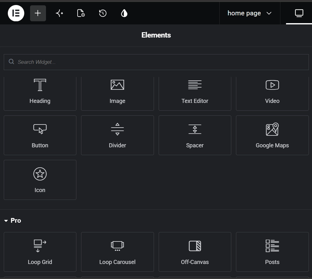
When you first open a page, the Elementor editor panel defaults to showing the Widgets Panel. You will see a grid of icons organized into categories: Basic, Pro, General, and Site. My biggest piece of advice here is to use the search bar. Typing the name of the widget you need is always faster than scrolling through sixty icons looking for the right one. If you use certain widgets constantly, mark them as favorites to bring them to the top of the list.
Layout in 2026 is built around the Flexbox and Grid Container systems. If you are coming from older versions of Elementor, leave the old Section and Column terminology behind. Containers are the modern standard. They produce less DOM depth, meaning fewer nested HTML elements, which translates directly into faster page speeds. This is one of the most important technical improvements Elementor has made, and the Elementor editor panel reflects this shift completely.
Navigating the Elementor Editor Interface
Before diving into the deep end of web design, you need to know where your tools are located and how the workspace behaves. This video gives you a quick grand tour of the Elementor editor, mapping out how widgets, columns, and sections interact to form your layouts. It’s the perfect guide to help you find your footing, master the left-hand settings panel, and learn a few handy shortcuts that will speed up your building process immensely.
The Triple-Tab System at the Heart of the Elementor Editor Panel

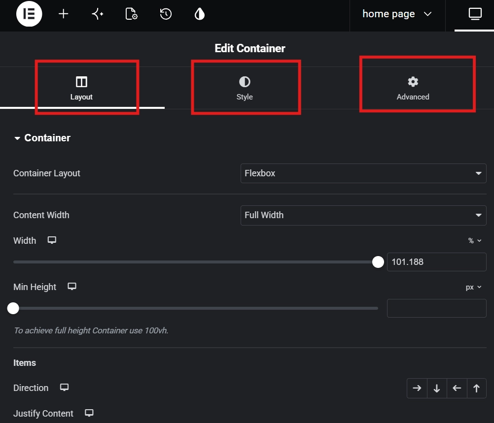
Every time you select an element on the canvas, the Elementor editor panel displays three tabs: Content, Style, and Advanced. Mastering the distinction between these three tabs is the single most important skill you can develop as an Elementor user. Mixing them up leads to what I call click fatigue, where you spend more time searching for settings than actually designing.
The Content tab is where the data lives. You enter text, upload images, set link URLs, and connect dynamic fields to a database here. Do not look for colors or fonts in this tab. It is strictly for what your element says or does.
The Style tab controls all the aesthetics. Typography, hex color codes, opacity, borders, and background images all live here. One habit that will save you enormous amounts of time is always using Global Colors instead of manually setting a hex code on each widget. Configure your brand colors once inside the Site Settings, then simply select the global variable. When a rebrand happens, you change one setting and every element updates automatically.
The Advanced tab is the engineering suite of the Elementor editor panel. Margins, padding, Z-index, CSS IDs, motion effects, and custom CSS all live here. If you need to hide an element on mobile, create an entrance animation, or override a default style with hand-coded precision, this is where you go. The rule to remember is simple: Content defines what, Style defines how it looks, and Advanced defines how it behaves and where it sits.
The Bottom Toolbar of the Elementor Editor Panel

The narrow strip at the very bottom of the Elementor editor panel is the most underrated part of the entire interface. Most beginners ignore it for weeks. It contains five icons that are essential for professional site management.
| Icon | Function | Professional Use Case |
|---|---|---|
| Settings (Gear) | Page-level controls | Changing page titles, status, or selecting a blank Canvas template |
| Navigator (Layers) | Document structure | Selecting hidden elements or organizing complex nested containers |
| History (Clock) | Undo/Redo log | Rolling back a specific design mistake made during the current session |
| Responsive Mode | Viewport switching | Testing how your layout breaks on tablet and mobile screens |
| Preview/Publish | Output control | Viewing the live site or pushing your local changes to the database |
The Navigator deserves special attention. As your layouts grow more complex, trying to click a deeply nested background container with your mouse becomes frustrating and slow. The Navigator gives you a tree-view of every element on the page, similar to the Layers panel in Photoshop. If you cannot find a widget on the canvas, open the Navigator and click it from the list. For more detail on this specific tool, the guide on Elementor Navigator: How to Manage Complex Layouts goes deep on making the most of it.
Global Site Settings: The First Place to Go in the Elementor Editor Panel

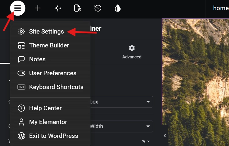
In the top-left corner of the Elementor editor panel, you will see a hamburger menu icon, three horizontal lines stacked on top of each other. Clicking this opens the Site Settings. Professional developers spend roughly twenty percent of a project inside this menu before they ever drag a single widget onto the canvas. The reason is simple: Site Settings defines all the defaults.
Inside this menu, you set your Global Typography, define the default content width, and establish your primary and secondary color palette. When you configure these correctly, every widget you drag onto the page already looks close to finished. You never have to manually change a font from Roboto to your brand font on each individual element. It saves hours of redundant work and ensures visual consistency across pages, even when multiple team members are building at the same time.
Managing Performance Inside the Elementor Editor Panel

The Elementor editor panel is a resource-intensive environment. It runs multiple JavaScript processes simultaneously to deliver a live preview of your design. On underpowered servers or browsers loaded with extensions, the panel can lag or fail to load entirely. If the panel stays grey or freezes, the most common culprit is a low PHP memory limit on your server. The guide on How to Fix Common Elementor Loading Issues covers every scenario in detail.
One of the most effective ways to keep the Elementor editor panel running fast is to disable widgets you never use. Every icon in the sidebar requires code to load. If you know you will never use the Star Rating or Progress Bar widgets, go to your WordPress dashboard, open Elementor settings, and disable them. A leaner sidebar loads faster and responds faster. This kind of technical discipline is one of the clearest differences between a hobbyist and a professional Elementor builder.
The Advanced Tab: The Most Misunderstood Part of the Elementor Editor Panel

The Advanced tab inside the Elementor editor panel is where the most common beginner mistakes happen. The biggest source of confusion is the difference between Margin and Padding. Margin is the space outside your element, pushing it away from other elements on the page. Padding is the space inside your element, creating breathing room between the content and the element’s border. If you want to move a button away from a text block, use Margin. If you want to make the button itself feel more spacious without changing the font size, use Padding.
The Advanced tab also gives you access to Custom Attributes and Motion Effects, both of which rely on standard CSS principles. Used well, they create polished, high-end user experiences. Used carelessly, they destroy your Core Web Vitals scores. A single, well-placed fade-in animation is professional. Ten bouncing headers on the same page is not. Use motion effects for emphasis, not decoration.
A great way to practice using all three tabs together inside the Elementor editor panel is to Create a Custom Button in Elementor. You will use the Content tab for the button text, the Style tab for the gradient background, and the Advanced tab for the hover animation. It is a simple exercise that locks in the logic of the whole system.
Best Practices for Working in the Elementor Editor Panel

Keep the Navigator open at all times on complex builds. Use the search bar for widgets instead of scrolling. Define your Site Settings before you place a single widget. Treat the three tabs as separate disciplines and never mix up their purpose. Disable any widgets you do not plan to use to keep the Elementor editor panel responsive and snappy.
The Elementor editor panel is designed to become invisible once you truly learn it. You should reach for the Style tab as a reflex, not after a moment of searching. You should open the Navigator automatically when a layout gets complicated. When you reach that level of fluency, you are no longer just making a website. You are architecting a digital experience. If you are still setting up your environment, revisit the Getting Started with Elementor hub before going further.
Additional Resources
- Getting Started with Elementor, the complete beginner hub for setting up your environment
- Elementor Navigator: How to Manage Complex Layouts, a deep dive into the Navigator tool
- How to Fix Common Elementor Loading Issues, troubleshooting a slow or frozen editor panel
- Create a Custom Button in Elementor, a hands-on exercise using all three panel tabs
- Introduction to CSS on MDN, foundational reference for the Advanced tab’s custom CSS features
- Web Design Standards on Wikipedia, broader context on modern layout principles