There was a project early in my freelance career where a client came back to me two weeks after launch complaining that their site was slow. I ran a PageSpeed audit and felt genuinely embarrassed. The homepage was loading a 4200-pixel wide JPEG into a container that was 800 pixels wide. I had dragged the image in, it looked fine on my screen, and I had moved on without thinking about what the browser was actually downloading. That one mistake was costing every visitor roughly three extra seconds of load time on mobile.
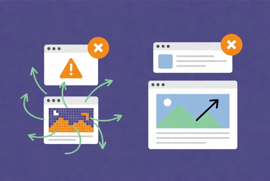
Adding and styling images in Elementor seems like one of the simpler tasks in web design. In practice, it is one of the areas where the most performance damage gets done, usually by people who know enough to add images but not quite enough to manage them correctly. Media files account for over 60 percent of a typical page’s total weight, which means every image decision you make is also a speed decision, an SEO decision, and an accessibility decision. This guide covers the full process from the right file formats before you even open the editor, through to the performance audit you should run before any page goes live. If you are still getting comfortable with the Elementor interface itself, the Getting Started with Elementor guide covers the foundation you need first.
Start With the Right Format Before You Touch the Editor
Images are absolutely vital for grabbing your readers’ attention and breaking up long walls of text on your blog, but they need to be handled correctly to keep your site fast and optimized. This tutorial walks you through how to use the Image widget, from basic formatting and rounding corners to implementing clean hover effects. Crucially, it also touches on adding proper alt text and descriptions, which is a massive help for boosting your blog’s image SEO and climbing the search rankings.
The most impactful image decision you make happens before you open Elementor at all. In 2026, AVIF and WebP are the standard formats for web imagery. According to Wikipedia’s entry on AVIF, this format delivers significantly better compression than older alternatives while maintaining visual quality. For anything other than complex photography with subtle gradients and tonal ranges, AVIF is the superior choice. Even for photography, modern compression algorithms in AVIF outperform JPEG in roughly 90 percent of real-world use cases.
JPEG should be considered a legacy format at this point, not a default. PNG is appropriate only when you genuinely need transparency and cannot achieve the same result through CSS masking or an AVIF with an alpha channel. Serving outdated formats to modern browsers is leaving both performance and quality on the table simultaneously.
Pro Tip: Install a WordPress image optimization plugin that automatically converts uploads to WebP or AVIF on the server side. This creates a safety net so that even when you or a client uploads a JPEG, the site still serves the optimized version to visitors.
How to Insert the Image Widget Without Making Common Mistakes
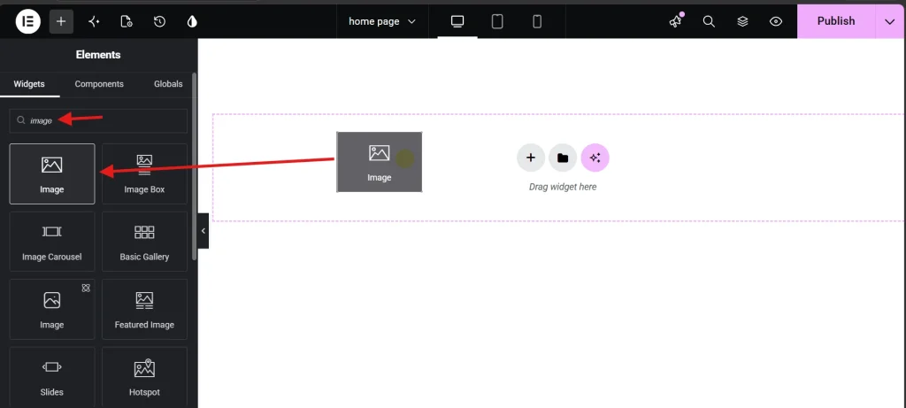
Drag the Image widget from the Elementor sidebar into your desired container. Before you click Insert on any file in the Media Library, look at the right-hand sidebar panel. Two fields there are non-negotiable for every image on every page.
The first is Alt Text. This field serves two distinct purposes that both carry real consequences if ignored. Screen readers use alt text to describe images to visually impaired users, making it a direct accessibility requirement. Search engine crawlers use it to understand what the image depicts, making it an SEO signal. For purely decorative images that add no informational value, an empty alt attribute is correct. For everything else, a concise and accurate description is required. If you experience any issues with uploads or cached display problems during this process, the guide on How to Fix Common Elementor Loading Issues covers the most common server and cache conflicts.
The second field to check before inserting is the Image Size dropdown. Elementor defaults to Large or Full, and choosing Full is one of the most common performance mistakes in the entire platform. If your content area is 800 pixels wide, loading a 4000-pixel image forces the browser to download data it will never display at that resolution. The result is a destroyed Largest Contentful Paint score. Always select the thumbnail size that most closely matches your actual rendered layout width.
Alignment and Captions as Professional Details
The Content tab also controls alignment and captions. Left, center, and right alignment options are available, though their effect depends on the width of the surrounding container. Captions are worth using when editorial credibility matters. You can pull the caption directly from the WordPress Media Library metadata or write a custom one inline. For photography, data visualizations, or any image where attribution or context adds value, captions signal professionalism and sourcing discipline.
Precision Image Styling in the Style Tab
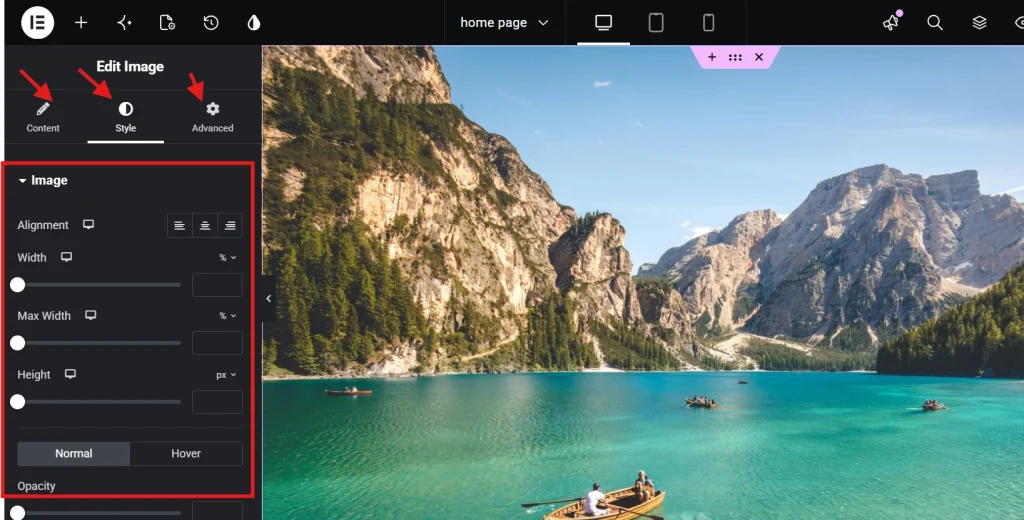
The Style tab is where your images go from inserted to intentional. Several settings here look similar but behave very differently, and using the wrong one produces layout problems that are difficult to diagnose later.
Width, Max Width, and Why the Difference Matters
Width and Max Width are not interchangeable. Setting Width to 100 percent forces the image to expand to fill its container regardless of the image’s actual pixel dimensions, which means a small image stretches and pixelates. Max Width set to 100 percent allows the image to fill its container but caps it at the image’s true dimensions, preventing quality degradation from upscaling. For almost every use case, Max Width is the correct setting. Height should be left as Auto to maintain the aspect ratio automatically rather than introducing distortion by forcing a specific vertical dimension.
| Setting | Function | Best Practice |
|---|---|---|
| Width | Sets a static or relative width | Use percentages for fluid layouts |
| Max Width | Caps the image size at a maximum value | Set to 100% to prevent overflow & upscaling |
| Height | Sets the vertical dimension | Leave as Auto to maintain aspect ratio |
| Object Fit | Determines how the image fills its box | Use Cover for fixed-size containers |
Object Fit deserves a specific explanation because it solves a problem that trips up many intermediate Elementor users. When you force a specific height on an image, the proportions distort unless you also set Object Fit to Cover. Cover tells the browser to scale the image so it fills the defined space completely without stretching, cropping the edges if necessary to maintain the aspect ratio. The practical result looks identical to a CSS background-image with background-size: cover, but it retains the SEO benefits of an inline img tag because search engines can still read and index the image content.
Border Radius, Box Shadows, and Modern Finishing Details
Rounded corners have become a standard visual language in modern web design and Elementor makes them simple. A border radius of 8px to 12px produces a clean, contemporary softening of image edges that reads as intentional rather than decorative. For circular profile images or avatars, ensure the source image is a perfect square and set the border radius to 50 percent. Applying 50 percent to a rectangular image produces an ellipse rather than a circle, which is almost never the intended result.
Box shadows can add effective depth when used conservatively. A blur of around 20px with an opacity of 0.1 creates a subtle lift that separates an image from the background without drawing attention to itself. Heavier shadows with high opacity, dark colors, and tight spreads visually date a design immediately. The shadow should support the composition, not compete with the image for attention.
CSS Filters, Hover Effects, and When to Use Them
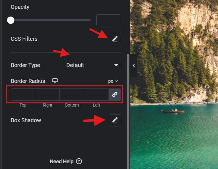
Elementor’s Advanced Effects section gives you access to CSS filters, including brightness, contrast, saturation, and blur, without writing a single line of code. These are genuinely useful for specific situations, particularly when text needs to be readable over an image and a slight brightness reduction or blur on the image creates the necessary contrast. The performance caveat is worth understanding though. CSS filters are calculated by the browser in real time during rendering. A page with fifty images all using active CSS filters will show measurable scroll lag on mobile devices, because the GPU is recalculating those filter values on every frame.
Hover animations on images follow the same principle of restraint. A subtle scale-up of 1.05 or an opacity shift on hover adds a layer of interactivity that feels polished and responsive. Set the Transition Duration to around 0.3 seconds for a snappy, satisfying feel. Anything beyond 0.5 seconds starts to feel sluggish, particularly for users scrolling quickly through a gallery or portfolio grid. For layout spacing around image-heavy sections, the guide on Using the Elementor Divider and Spacer Widgets covers how to create proper breathing room without adding unnecessary DOM weight.
Image Masking: A High-Performance Alternative to Transparent PNGs
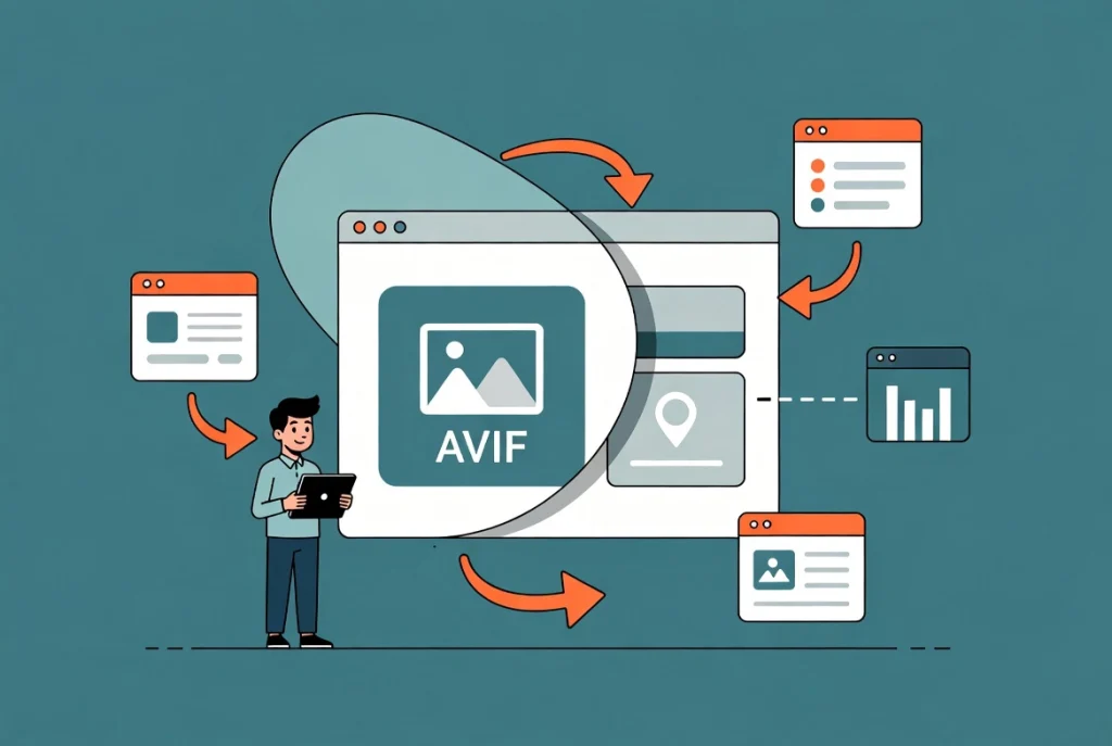
Image masking is one of the most underused features in the Elementor Advanced tab, and it solves a file size problem that many designers work around in the wrong direction. When a design calls for an organic or non-rectangular image shape, the common approach is to export the image as a transparent PNG with the shape cut out. The problem is that a PNG with transparency is almost always significantly heavier than a standard AVIF of the same visual content.
Masking offers a better path. You upload a square or rectangular AVIF, which is already compressed efficiently, and apply a CSS mask in the shape you need directly inside Elementor. Toggle the Mask option to On in the Advanced tab, choose a shape from the dropdown or upload a custom SVG path, then scale and position the mask until the focal point of the image sits exactly where you want it. The result is the organic shape you designed with a fraction of the file size a transparent PNG would require. It is one of those techniques that looks impressive to clients and costs almost nothing in performance terms.
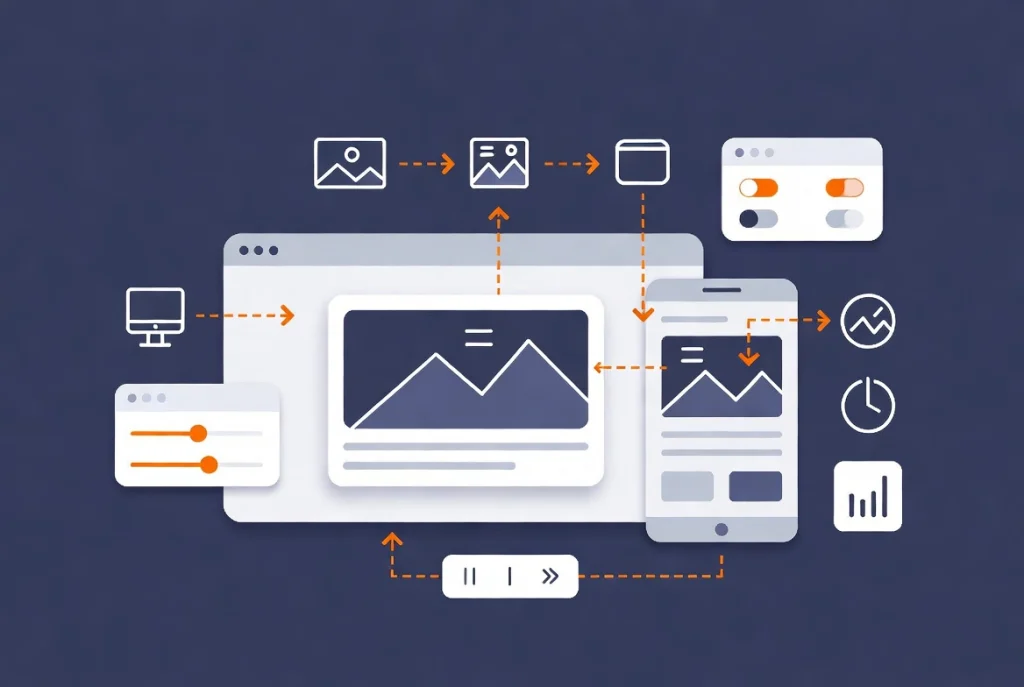
Responsive Image Controls and Mobile Optimization
A desktop image configuration rarely translates cleanly to mobile without adjustments. Elementor’s device-specific breakpoint icons next to each setting let you define different width and alignment values per screen size. An image set to 30 percent width on desktop will typically need to be 100 percent width on mobile to remain readable without requiring the user to zoom in.
Mobile visitors are also frequently on slower data connections, which makes every kilobyte of image data more consequential on small screens than on desktop. The W3C standards for accessible images provide a solid framework for ensuring your responsive image implementations serve all users, including those on assistive technologies. When overlaying text on images at the mobile breakpoint, check your contrast ratio specifically for that view. An overlay that looks sufficient at desktop size may fall below the WCAG 4.5:1 requirement when the image crops differently on a narrower screen.
Lazy loading is enabled by default in Elementor for most widgets and should stay on for all images below the fold. It prevents the browser from downloading images that are not yet visible in the viewport, saving bandwidth and accelerating the initial page render. The one exception is the primary above-the-fold image on your page. Lazy loading the first visible image delays the browser from starting that download until a script fires, which directly hurts your Largest Contentful Paint score. For the hero image specifically, disable lazy loading so the browser begins fetching it immediately on page load.
Performance Audit: Verifying Your Images Before Going Live
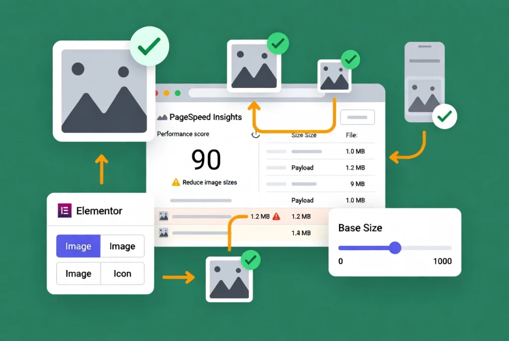
Styling images correctly is only half the job. Verifying their impact before publication is the other half, and skipping the audit is what allows the kind of mistake I described at the start of this article to survive into a live environment.
Run your page through Google PageSpeed Insights after building. The two warnings that indicate image problems most directly are “Avoid enormous network payloads” and “Properly size images.” If Elementor is serving a 1200-pixel image to a mobile device that only needs a 400-pixel version, the base image size in the Content tab needs to be changed. Elementor uses WordPress’s native srcset functionality to serve appropriately sized versions to different screen sizes, but this system only works correctly when you select a reasonable base size to begin with. Choosing Full as the base size breaks the srcset logic entirely.
Open the Navigator tool as well and check whether any Image widgets are being used for icons or small decorative graphics. Icons implemented as image files are difficult to style, scale poorly at different resolutions, and load heavier than SVGs for the same visual result. Replace any image-based icons with the Icon widget or an uploaded SVG file.
Mistakes That Define Amateur Image Work
Professional web work is as much about what you avoid as what you do. Using the Image widget for icons is the most common structural mistake. Baking text into image files is a close second. Text embedded in an image file is invisible to search engines, unreadable by screen readers, and becomes pixelated and illegible when the image scales down on mobile. When a design calls for text over an image, the correct approach is a background image on the container with an Elementor Heading widget layered on top as HTML text.
Excessive Motion Effects on images deserve the same caution. Parallax scrolling used thoughtfully on a single hero section creates depth and visual interest. A page where every image enters from a different direction, scales, fades, and rotates on scroll is distracting in a way that actively works against the content. Motion should direct attention toward your most important call to action, not signal how many animation options Elementor has available. The quality of your images and layout should carry the page. Effects are punctuation, not the sentence itself.
Frequently Asked Questions About Adding and Styling Images in Elementor
What image format should I use in Elementor in 2026?
AVIF is the best choice for most images in 2026, offering superior compression and quality compared to JPEG and PNG. WebP is a solid fallback for environments where AVIF support is not yet complete. JPEG should be reserved for complex photographic content where you have specific reasons for avoiding conversion, and even then AVIF typically outperforms it. PNG remains appropriate only when true transparency is needed and CSS masking is not a viable alternative.
Why is my image blurry after I add it in Elementor?
Blurriness almost always means the image is being displayed at a larger size than its actual pixel dimensions. This happens when Width is set to 100 percent on a small image, forcing it to stretch beyond its native resolution. The fix is to use Max Width instead of Width, which allows the image to scale up to its container but caps it at the image’s true dimensions. If the image needs to fill a larger space clearly, replace it with a higher-resolution source file.
Should I disable lazy loading for all images?
No. Lazy loading should stay enabled for all images below the fold, meaning any image that is not visible immediately when the page loads. The only exception is the primary above-the-fold image, usually the hero image. Lazy loading that specific image delays the browser from downloading it until a script triggers, which hurts your Largest Contentful Paint score. Disable lazy loading only for that first visible image and leave it enabled for everything else.
What does Object Fit do and when should I use it?
Object Fit controls how an image fills a box when you have specified fixed dimensions for both width and height. Without it, the image distorts to fit the defined dimensions. Set to Cover, Object Fit scales the image so it fills the space completely while maintaining its aspect ratio, cropping the edges if necessary. This is the correct setting whenever you have a fixed-height image container, such as a uniform grid of portrait images that all need to appear the same size regardless of their original aspect ratios.
How do I make an image circular in Elementor?
Ensure your source image is a perfect square, meaning equal width and height in pixels. Then set the Border Radius to 50 percent in the Style tab. Applying 50 percent border radius to a rectangular image produces an ellipse rather than a circle. If your image is not square, crop it to equal dimensions before uploading. For profile photos and avatars, saving a square-cropped version as your standard template avoids this issue entirely.
Can I use an image as a background in Elementor without losing SEO value?
Yes, by combining a CSS background image on the container with the Object Fit: Cover setting on an inline Image widget. Purely CSS background images are not indexed by search engines because they are applied through stylesheets rather than HTML img tags. Using an Image widget with Object Fit: Cover produces the same visual result as a background image but retains the alt text and img tag that search engine crawlers can read and index.
Additional Resources
- WordPress Basics and Installation: The Complete Beginner’s Guide
- Getting Started with Elementor in 2026: The Complete Guide
- How to Add Background Images and Overlays in Elementor
- Adding Video Backgrounds to Elementor Sections
- Responsive Design Basics: Making Elementor Sites Mobile-Friendly
- Using the Elementor Divider and Spacer Widgets
- How to Fix Common Elementor Loading Issues
- Basic SEO Settings for Elementor Pages
- Elementor Best Practices for Beginners
- How to Preview and Publish Your Elementor Page
- AVIF Image Format: Wikipedia
- W3C Standards for Accessible Images
Final Thoughts: Every Image Is a Performance Decision
The difference between a site that loads in one second and one that loads in four is almost always images. Not the layout. Not the animations. and the fonts. The images. Treating every file you add to Elementor as a performance liability that needs to be justified, sized correctly, formatted properly, and audited before publication is the habit that separates sites that rank and convert from sites that just exist.
Use AVIF or WebP from the start. Set Max Width instead of Width. Apply Object Fit: Cover when dimensions are fixed. Keep lazy loading on except for the hero image. Run PageSpeed Insights before every launch. These are not advanced techniques. They are the baseline standard for professional image work in 2026, and building them into your process now means you will never have to go back and fix a slow site after launch. If you want to revisit the broader WordPress foundation underneath everything covered here, the WordPress basics and installation guide is always a useful reference to return to.