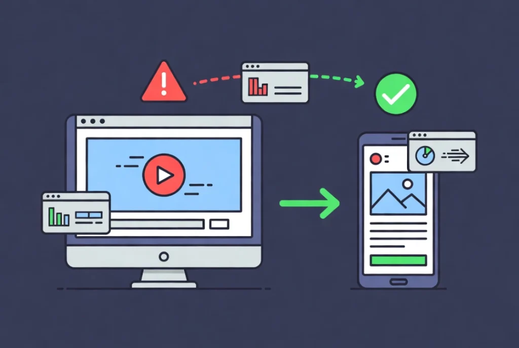
A client once sent me a message that read: “The site looks amazing on my laptop but completely broken on my phone.” I opened it on my own phone and felt that particular kind of embarrassment that stays with you. Everything was there, the text, the images, the buttons, just completely wrong. Columns that should have stacked were overlapping. Padding that looked elegant on a wide screen was eating the entire viewport on mobile. The site had passed every visual check I ran in the editor and failed the moment it hit a real device.
Making Elementor sites mobile-friendly is not about shrinking a desktop layout and hoping it holds together. It requires understanding how CSS inheritance flows through Elementor’s breakpoint system, how Flexbox containers reflow content, and which performance decisions matter most on slower mobile connections. In 2026, mobile devices account for nearly 70 percent of all web traffic, which means a site that fails on a phone is effectively turning away two-thirds of its potential audience. Before diving into the technical specifics here, the Getting Started with Elementor guide covers the foundational interface knowledge you will need as a starting point. And if you want to go even further back to the WordPress basics, the WordPress basics and installation guide is where that foundation begins.
Understanding the Cascade and Inheritance Logic in Elementor
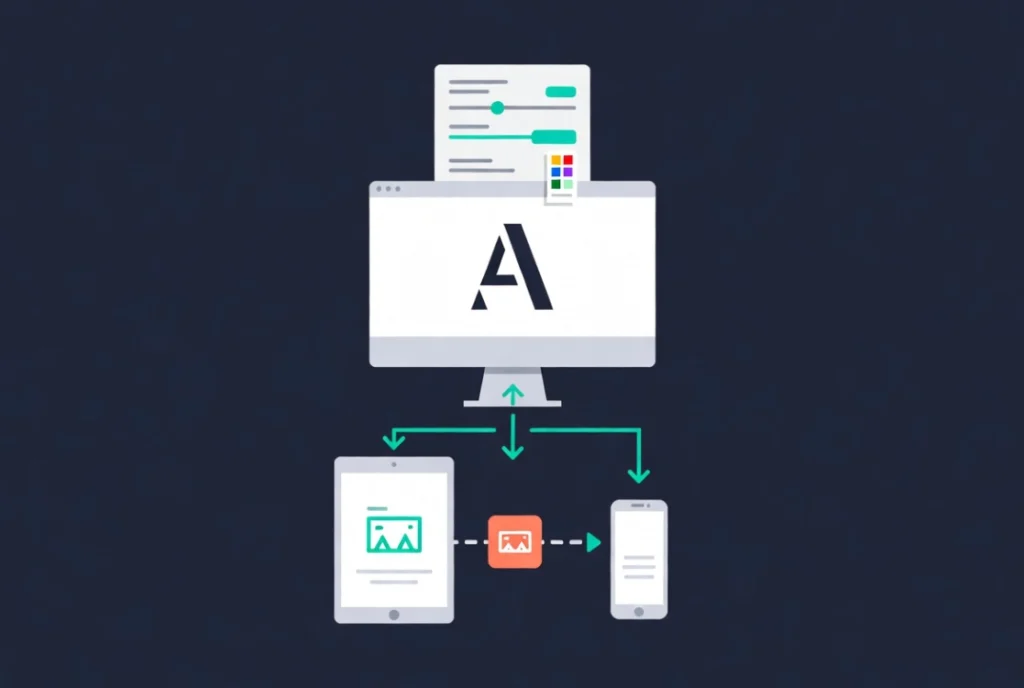
Elementor uses a top-down inheritance model for its responsive breakpoints. Desktop is the parent, tablet is the child, and mobile is the grandchild. A font size set to 60px on desktop flows down to tablet and mobile automatically unless you override it at a smaller breakpoint. Most of the time, 60px looks terrible on a phone screen, so you click the viewport icon next to the setting and adjust the value specifically for mobile. Once that override is in place, the connection to the desktop parent breaks for that specific attribute, giving you surgical control over exactly how each element behaves at each screen size.
The trap most designers fall into here is over-tweaking. Changing every margin, padding, and font size individually for every breakpoint produces a bloated stylesheet that becomes genuinely difficult to maintain six months later. A cleaner approach is to set global typography and color palettes at the site level first, then move to device-specific overrides only when the layout objectively breaks. This discipline keeps the code lean, which matters especially on mobile where slow connections penalize every extra kilobyte of CSS the browser has to parse.
Why Viewport Units Beat Pixels for Mobile Layouts
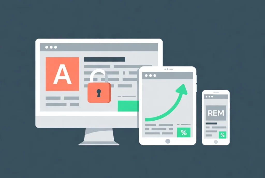
Pixels are static. Screens in 2026 are anything but, ranging from foldable phones to ultra-wide monitors with resolutions that would have seemed implausible five years ago. Relying on fixed pixel values for font sizes and container widths creates rigid layouts that break on non-standard resolutions in ways that are difficult to predict and tedious to fix one device at a time.
Relative units solve this at the source. Setting a heading to 5vw means the text always occupies 5 percent of the screen width, scaling naturally from large monitors down to compact phone displays without requiring individual breakpoint overrides. REM units go further for accessibility. Because REM scales based on the browser’s root font size, a user who has increased their default font size for visual accessibility reasons will see your layout respect that preference automatically. Data on real-world screen resolution distribution from StatCounter is worth reviewing regularly to understand which screen sizes your specific audience actually uses and which units serve them best.
Managing Flexbox Containers for Mobile Reflow
Elementor’s shift to Flexbox Containers brought a meaningful improvement to responsive layout management. Three containers sitting side by side on desktop need to stack vertically on mobile, and the Direction toggle in the container settings handles this cleanly. Setting the mobile direction to Column is the standard starting point for any multi-column layout.
More complex situations require a bit more thought. Consider a page where alternating sections place an image on the left and text on the right, then text on the left and image on the right. On desktop, this creates a pleasant visual rhythm. On mobile, where everything stacks vertically, that rhythm collapses into image, text, image, text in a sequence that can feel visually cluttered depending on the content. The Reverse Columns feature in the container settings lets you flip the stacking order on mobile without changing the desktop layout, preserving the intended alternating rhythm across both views. For a practical walkthrough of this in a real page context, the guide on Creating a Simple Landing Page with Elementor shows these techniques applied to a full build.
Pro Tip: Always check alternating content sections on a real mobile device after adjusting the Direction and Reverse Columns settings. The Elementor preview gives you a reasonable approximation, but the visual rhythm of stacked content only becomes fully clear at actual phone dimensions with real content loaded.
The Hidden Element Strategy and Its Performance Cost
Not everything that works on desktop belongs on mobile. A high-resolution video background that looks stunning on a large monitor becomes a bandwidth liability on a phone with a patchy connection, damaging load times and burning through data for users on capped plans. Elementor’s Responsive tab in the Advanced settings lets you hide specific elements, containers, or entire sections by device, which seems like a clean solution at first glance.
The important thing to understand is that hiding an element in Elementor does not remove it from the DOM. The browser still parses and loads that hidden code on every page request, which means a page with many hidden mobile elements is still carrying the full weight of those elements in terms of load time. A better approach in most cases is to serve a lighter version of the content rather than hiding the heavy one. Replacing a video background with a compressed static image for mobile visitors improves the Largest Contentful Paint score, reduces bandwidth consumption, and produces a genuinely faster experience rather than just a visually cleaner one.
Touch Targets, Navigation, and the Human Thumb
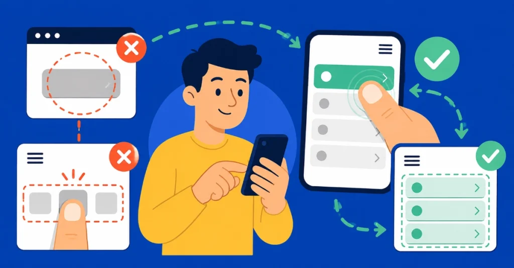
Desktop users operate with a mouse cursor precise enough to hit a 10-pixel target without effort. Mobile users operate with a thumb, which is a considerably blunter instrument. This is the most consistent failure point in mobile designs built by people who primarily test on desktop, and it shows up as buttons too small to tap reliably, links packed too closely together, and navigation menus where selecting one item accidentally triggers the one next to it.
Touch targets should be at least 44 by 44 pixels, which is the standard recommended by the W3C Web Accessibility Initiative. In Elementor, increasing button padding specifically for the mobile breakpoint is the fastest way to meet this threshold without affecting the desktop layout. Navigation menus deserve the same attention. The hamburger toggle icon needs to be large enough to hit on the first attempt, and spacing between menu items should give thumbs enough room to land accurately without activating adjacent links.
Testing Beyond the Elementor Preview
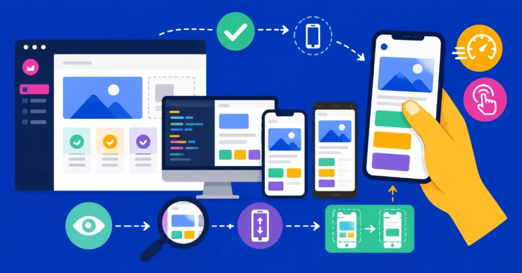
The responsive preview inside Elementor is a useful starting point for catching obvious layout problems. It is not a substitute for real device testing. The preview simulates screen width but does not replicate the browser engine, processor speed, or touch interface of an actual phone. Sites that look clean in the editor frequently stutter on real hardware when scroll effects or heavy animations trigger the mobile GPU under load conditions the desktop handles effortlessly.
Professional testing means using physical devices alongside browser inspection tools. Safari on iOS and Chrome on Android render certain CSS properties differently, and that gap catches many designers off guard. Pay particular attention to how the browser address bar behaves as you scroll, because the way it hides and reveals itself on mobile shifts the visible viewport height and can cause layout jumps in designs that rely on fixed viewport height values. For managing revisions during testing without losing earlier work, the Elementor History Tool guide covers how to step back through changes safely.
Image Optimization for Mobile Performance
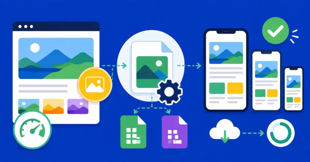
Images are typically the heaviest contributors to page weight, and their impact is amplified on mobile where connections are slower and bandwidth is more constrained. Elementor works with WordPress’s native responsive image functionality, using the srcset attribute to serve the appropriately sized image version to each device automatically. This system works well when the base image size is set correctly in the widget settings. Forcing Full size as the base breaks the srcset logic and sends an oversized file to every device regardless of its actual screen width.
For format, WebP and AVIF are the standard in 2026 and there is no practical reason to serve JPEGs or PNGs when optimized alternatives are available. Modern compression in these formats reduces file sizes substantially without visible quality loss, and every kilobyte saved translates directly to faster Time to Interactive on mobile. A one-second delay in page load reduces conversions by up to 20 percent, which makes image optimization one of the highest-return technical improvements you can make to any mobile experience.
Custom Breakpoints: Power and Restraint
Elementor’s standard desktop, tablet, and mobile breakpoints cover the majority of real-world layout needs. For specific cases where the layout breaks awkwardly at a size that sits between the default breakpoints, custom breakpoints can be added through Site Settings. A Mobile Extra or Tablet Extra breakpoint gives you additional control points in the cascade, useful for distinguishing between large tablets like an iPad Pro and small tablets with significantly different viewport dimensions.
The discipline here is using this feature only when the content genuinely requires it rather than as a default approach for every layout challenge. Each additional breakpoint multiplies the number of device-specific overrides that need to be maintained going forward. A layout that requires eight custom breakpoints to function correctly is almost certainly a layout that needs to be rethought structurally rather than patched with more cascade steps. Design for the content’s natural breaking point, not for specific named devices. That principle is what keeps responsive sites maintainable as new screen sizes enter the market.
Frequently Asked Questions About Making Elementor Sites Mobile-Friendly
Does changing a setting on desktop automatically apply to mobile in Elementor?
Yes, by default. Elementor uses a top-down inheritance model where desktop settings cascade down to tablet and mobile unless you specifically override them at a smaller breakpoint. Once you set a device-specific value for a setting, the cascade link to the desktop parent breaks for that attribute only, leaving all other settings still inherited from desktop. This means you should set your global styles at the desktop level first and only add mobile overrides where the layout actually needs them.
What is the minimum button size for mobile in Elementor?
The W3C Web Accessibility Initiative recommends a minimum touch target size of 44 by 44 pixels. In Elementor, you achieve this by increasing button padding at the mobile breakpoint specifically. A common starting point is 20px top and bottom padding with full-width buttons on mobile, which ensures the tap area is large enough for reliable thumb navigation without accidentally triggering adjacent elements.
Should I use pixels or REM for font sizes in Elementor?
REM is the better choice for font sizes in almost every case. Unlike pixels, REM scales relative to the browser’s root font size, which means users who have increased their default font size for accessibility reasons will see your typography respect that preference. Pixels ignore browser-level font scaling entirely, creating accessibility barriers for users who depend on it. For container widths and layout dimensions, viewport units like VW offer fluid scaling that adapts naturally across the full range of modern screen sizes.
Is the Elementor responsive preview accurate enough for final testing?
No. The preview simulates screen width but does not replicate the browser engine, GPU, processor speed, or touch behavior of a real device. Sites that pass the editor preview often reveal layout jumps, animation lag, and touch interaction problems on actual phones. Real device testing, combined with browser inspection tools on both iOS Safari and Android Chrome, is the only reliable way to catch these issues before a site goes live.
What happens to hidden elements in the Elementor DOM?
Hidden elements remain in the DOM and are still downloaded and parsed by the browser even though they are not displayed. This means hiding many elements on mobile does not reduce the page’s actual load time the way removing or replacing them does. For performance-critical situations, serving a lighter alternative, such as a compressed static image instead of a video background, is more effective than hiding the heavy element and leaving it in the code.
Additional Resources
- WordPress Basics and Installation: The Complete Beginner’s Guide
- Getting Started with Elementor in 2026: The Complete Guide
- How to Use Elementor Flexbox Containers: A Beginner’s Guide
- Creating a Simple Landing Page with Elementor
- Adding Video Backgrounds to Elementor Sections
- Adding and Styling Images in Elementor
- How to Use the Elementor History Tool
- How to Create a Custom Button in Elementor
- Elementor Best Practices for Beginners
- How to Preview and Publish Your Elementor Page
- StatCounter: Global Screen Resolution Statistics
- W3C Web Accessibility Initiative: Touch Target Standards
Final Thoughts: Mobile Is the Real Test of Your Build
A site that works on desktop but fails on mobile is not a finished site. It is a half-finished one. The real test of any Elementor build is how it behaves on the device most of your visitors are actually using, with a thumb as the input method, a smaller viewport as the canvas, and a mobile connection as the delivery mechanism. Starting with global styles, choosing relative units from the beginning, building with Flexbox containers that reflow naturally, optimizing every image before it goes anywhere near a live environment, and testing on real hardware before calling anything done, these are the habits that produce sites that actually work for the people visiting them. The WordPress basics and installation guide is always there as a foundation to return to if you need to revisit anything from the ground up.