
The first time I switched to Elementor Flexbox Containers, I closed the editor after twenty minutes and went back to Sections and Columns. The interface looked different. Terms like “Main Axis” and “Justify Content” felt abstract when all I wanted was an image on the left and text on the right. What I missed at the time was that the new system was not harder. It was more direct. Once the two-axis logic clicked, I rebuilt that same layout in under a minute and never looked back.
Elementor Flexbox Containers replace the legacy Section and Column architecture with a leaner layout system built on CSS Flexbox. Every modern professional Elementor build uses them. This guide walks through the core concepts from scratch so the logic makes sense before you touch a single setting. If the Elementor editor is still new territory, the Getting Started with Elementor guide covers the foundational interface knowledge worth having first. For the WordPress layer underneath everything, the WordPress basics and installation guide is where that foundation starts.
Why Elementor Flexbox Containers Replace the Old Section System
The legacy layout system stacked Sections, Columns, and Inner Sections into a deeply nested hierarchy. A single section with two columns and a few widgets produced ten or more nested div tags in the HTML output. That depth slows browser rendering. It also damages Core Web Vitals scores, specifically the Largest Contentful Paint metric that search engines use as a ranking signal.
Containers flatten this structure. A widget sits directly inside its container without requiring a column wrapper. According to technical documentation from MDN Web Docs, Flexbox allows more efficient rendering because the browser calculates layout in a single pass rather than traversing a deep node tree. Switching from sections to containers reduces page weight by 20 to 30 percent on typical builds. That reduction shows up directly in performance audit scores.
Setting Up Your Page Layout with Containers
Before we start throwing widgets onto the page, we need a solid foundation, and that’s where Elementor’s containers come into play. They give you total freedom to structure your blog posts and landing pages exactly how you envision them without making the backend messy. Let’s take a quick look at this official video tutorial, which shows the easiest ways to create, nest, and organize your layouts from scratch.
| Feature | Legacy Sections | Flexbox Containers |
|---|---|---|
| DOM Depth | High, nested divs | Low, flat structure |
| Flexibility | Limited by column structure | Infinite direction control |
| Spacing | Widget space and margins | Centralized Gap control |
| Mobile Control | Requires column hiding | Easy order reversing |
The Two Axes: The Core Concept That Makes Everything Click
Every Flexbox Container operates on two axes. Understanding them is what makes the rest of the settings feel logical rather than arbitrary.
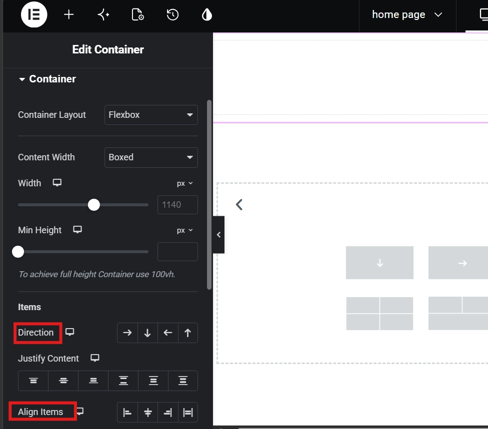
The Main Axis runs in the direction your items flow. Set the container to Row and the Main Axis runs horizontally. Set it to Column and it runs vertically. The Cross Axis always runs perpendicular to the Main Axis. In a Row container, the Cross Axis runs vertically. In a Column container, it runs horizontally.
Justify Content moves items along the Main Axis. Align Items moves them along the Cross Axis. That single distinction eliminates the confusion that trips up most beginners. Centering something vertically fails when Justify Content and Align Items point in the wrong directions for the container’s current orientation. The CSS Flexbox specification this system builds on has powered modern web layouts for years. Elementor exposes the same logic through a visual interface, no code required.
Direction Options and When to Use Each
Row flows items left to right and covers the majority of desktop layouts. Column stacks items top to bottom and handles most mobile views. Row Reversed and Column Reversed flip those directions. These are specifically useful when mobile layout order needs to differ from desktop without duplicating content. An image below text on desktop can sit above it on mobile using Row Reversed at the mobile breakpoint, with no extra containers required.
Justify Content and Align Items in Practice
Center aligns items at the midpoint of the Main Axis. Space Between distributes items with equal gaps between them but none at the edges, making it ideal for navigation bars and galleries. Space Around adds equal space on both sides of each item. These three options cover most layout needs without touching individual widget margins. Align Items set to Center on a Row container with a fixed height keeps all content vertically centered, which the old column system needed multiple workarounds to achieve.
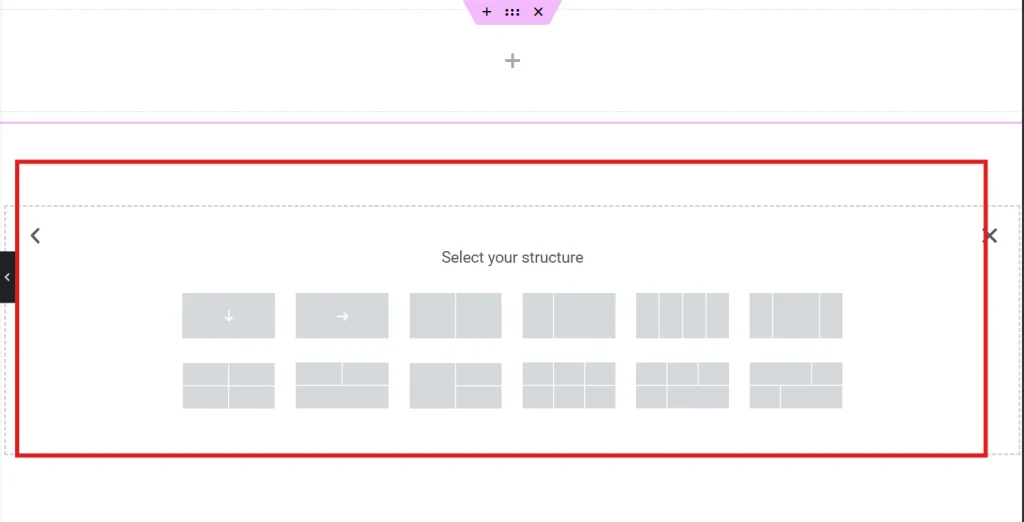
Setting Up Your First Flexbox Container
Drag a Container widget onto the canvas. Widgets like headings, images, and buttons drop directly into it without needing a column wrapper first. Click the Container handle and open the Layout tab. Direction, Justify Content, Align Items, and Gap all sit here. Play with each one. Watch how the widgets respond on the canvas. That live feedback builds intuition faster than any written explanation.
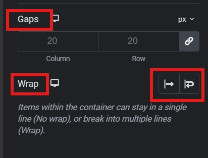
Gap replaces the individual widget margins the old system required. Set Gap to 20px and every item inside the container gets 20px of breathing room between it and its neighbors automatically. Changing that single value later updates every item at once. For anyone still reaching for spacer widgets to create breathing room, the guide on Using the Elementor Divider and Spacer Widgets explains where they still fit in a modern container workflow.
The Wrap setting handles overflow when items cannot all fit on one line. Five icons in a row at desktop width that crowd together on mobile automatically push to a second line when Wrap is enabled. This produces correct mobile behavior without a single breakpoint override.
Pro Tip: Consistency in Gap values pays off across a full site build. If 20px works for your main layout gaps, apply it everywhere. A uniform spacing system creates a professional, balanced look that ad hoc margins never quite achieve.
Advanced Flex Properties: Order and Grow
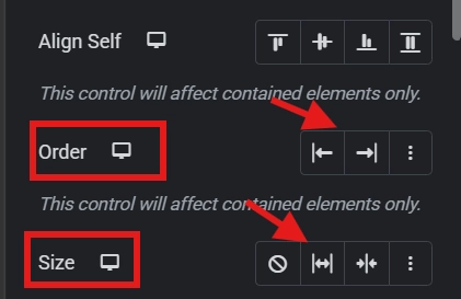
Inside the Advanced tab of any widget placed in a container, the Flex Properties section unlocks two controls the old column system could not replicate.
The Order property changes where an item appears visually without moving it in the Navigator. A CTA button assigned Order 1 appears first in the container regardless of its source code position. On mobile, important content stays at the top of the screen without duplicating elements or using hide and show responsive toggles. The button sits in its logical code position but renders first for the user.
Flex Grow controls how much available space an item claims relative to its siblings. Set one item to Grow 1 and another to Grow 2 and the second item takes twice the available free space. A text block set to Grow 1 beside a fixed-width button expands to fill all remaining horizontal space. This is more stable than percentage widths on columns. It responds to actual available space rather than a fixed proportion of the container width, staying correct across every screen size without breakpoint overrides.
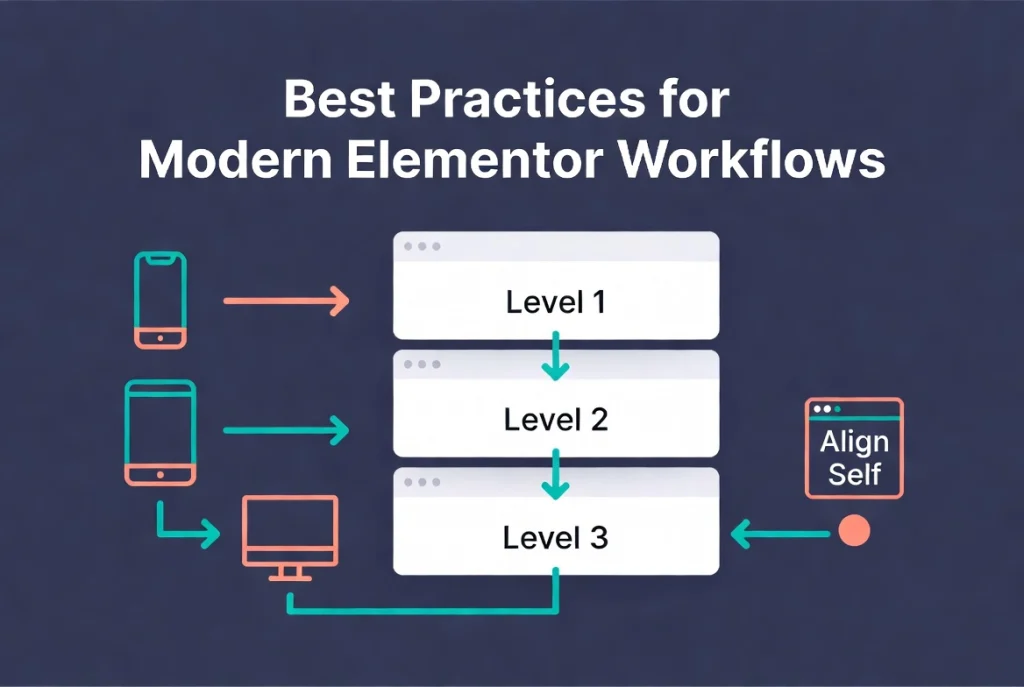
Best Practices for Modern Elementor Workflows
Flat is fast. Keep nesting to a maximum of three levels deep wherever the design allows. More than three levels usually signals a layout that a single container with Wrap could handle more efficiently. The Navigator panel makes nesting depth immediately visible. Opening it at intervals during a build catches unnecessary wrapper containers before they accumulate into a bloated DOM. For a full walkthrough of reading and managing the Navigator, the Elementor Navigator guide covers the panel in detail.
Building mobile-first produces cleaner responsive results than shrinking desktop layouts down. Start with Column direction for small screens, then switch to Row at tablet and desktop breakpoints. This identifies which content actually matters for mobile users at the start rather than during a late-stage responsive audit. The guide on Responsive Design Basics: Making Elementor Sites Mobile-Friendly applies this approach to a complete build with every breakpoint decision covered.
Use the Align Self property for individual widgets when one specific item needs to behave differently from the rest of the group. All items centered in a container except one logo aligned to the top is a common pattern. Align Self handles that case without overriding the container’s global Align Items setting.
Frequently Asked Questions About Elementor Flexbox Containers
Can I still use the old Sections and Columns system in Elementor?
Yes. The legacy system still works on existing pages. New builds should use Flexbox Containers exclusively. Elementor made containers the default for new pages in recent versions, and the performance advantages make them the correct choice for any page built in 2026. Migrating existing pages from sections to containers requires rebuilding layouts manually, so most developers migrate only when a page undergoes significant redesign work.
What is the difference between Justify Content and Align Items?
Justify Content controls spacing along the Main Axis, the direction items flow. Align Items controls positioning along the Cross Axis, perpendicular to the flow direction. In a Row container, Justify Content handles horizontal distribution and Align Items handles vertical positioning. In a Column container, the axes flip. Getting this distinction clear is the single most useful concept a Flexbox beginner can lock in, because nearly every layout problem traces back to applying the wrong setting to the wrong axis.
How does Gap differ from adding margins to individual widgets?
Gap applies a uniform distance between all items in the container from a single setting. Margins apply to individual widgets and require separate adjustment on each one. Gap updates every item at once when changed, making global spacing adjustments fast and consistent. It also avoids the edge spacing problem that margins create, where the first and last items in a row end up with extra space against the container walls. Gap only creates space between items, not around the outside of the group.
When should I use Flex Grow instead of a percentage width?
Flex Grow is more stable for dynamic layouts. It responds to actual available space rather than a fixed percentage of the container width. A text block set to Grow 1 beside a 120px button always fills exactly the remaining space regardless of container width. Percentage widths can produce layout breaks when container widths change at breakpoints, because the percentages no longer add up to 100 after padding and gap values apply.
Do I need to activate Flexbox Containers in Elementor settings?
Containers are active by default in current versions of Elementor. On older installations updated before containers became the default, the feature may need switching on through Settings then Features inside the Elementor dashboard menu. Any page started after enabling containers uses the new system. Pages built before the feature was enabled continue using the legacy structure until manually rebuilt.
Additional Resources
- WordPress Basics and Installation: The Complete Beginner’s Guide
- Getting Started with Elementor in 2026: The Complete Guide
- Understanding Elementor Sections, Columns, and Widgets
- How to Create Your First Page with Elementor
- Elementor Navigator: How to Manage Complex Layouts
- Responsive Design Basics: Making Elementor Sites Mobile-Friendly
- Using the Elementor Divider and Spacer Widgets
- Elementor Best Practices for Beginners
- How to Save and Reuse Elementor Templates
- Basic Concepts of Flexbox: MDN Web Docs
- CSS Flexbox: Wikipedia
Final Thoughts: Think in Flow, Not in Fixed Columns
The mental shift from fixed columns to flowing containers is the real learning curve here. Columns think in percentages. Containers think in proportions, directions, and available space. Once that shift happens, layouts that used to require nested sections and hidden elements become single containers with a Gap value and a direction toggle. The code gets shorter. Performance gets faster. Responsive behavior becomes easier to control with each build.
Start with a simple Row container holding three widgets. Adjust Direction, Gap, Justify Content, and Align Items one at a time and watch the canvas respond. That fifteen minutes of live experimentation builds more intuition than any amount of reading. If you need to revisit the WordPress foundation beneath all of this, the WordPress basics and installation guide is always the right place to start.