Elementor Icon Box vs Image Box: Which Widget to Use (2026)
Early in my design career, I built a services section using three plain text columns. The content was solid. The layout was clean. Yet something about it felt lifeless, and visitors scrolled past it without stopping. A colleague looked at it and said, “You are asking people to read when you could let them scan.” He replaced the text columns with three icon boxes, each with a bold icon at the top, a short title, and two sentences of description. Time on that section increased immediately. That one change taught me the practical difference between presenting information and communicating it. The Elementor Icon Box and Image Box widgets exist precisely for this purpose, and knowing when to use each one makes a measurable difference in how visitors engage with a page. This guide covers the full configuration of both widgets, the strategic decision between them, and the common mistakes worth avoiding from the start. If the Elementor editor is still new territory, the Getting Started with Elementor guide covers the interface foundation first. For the WordPress layer beneath everything here, the WordPress basics and installation guide is where that foundation begins.
⚡ Quick Summary (TL;DR)
- Visually scannable layouts significantly boost visitor engagement by replacing dense, heavy columns of text with organized information blocks.
- The Elementor Icon Box widget uses clean vector icons to help readers scan and quickly understand abstract concepts or features.
- The Elementor Image Box widget uses concrete photography to build trust, humanize team profiles, and showcase physical products effectively.
- Choosing the right image size and utilizing lightweight SVG files keeps your page performance fast while maintaining crisp visual quality.
- Overloading either widget with too much description text ruins the scanning experience and creates an unprofessional look on mobile screens.
What the Icon Box Widget Does and When to Use It
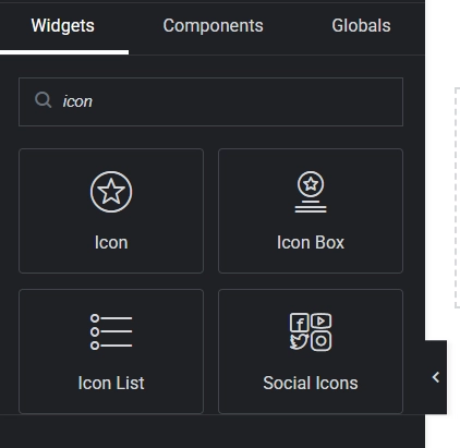
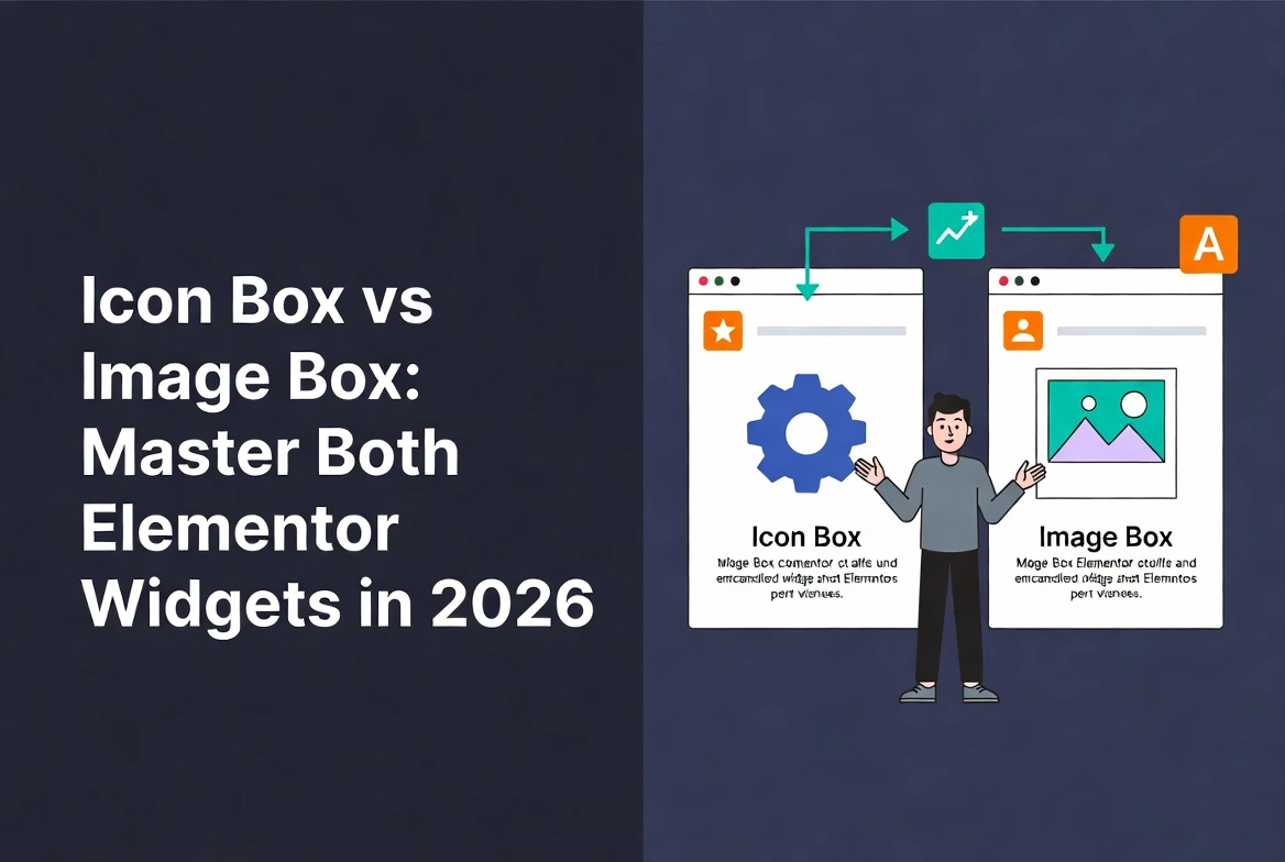
The Icon Box widget combines a vector icon, a title, and a brief description into a single structured unit. Its core strength is representing abstract concepts quickly. Users scanning a page process icons faster than words, which makes the Icon Box ideal for feature lists, service overviews, process steps, and value propositions where rapid comprehension matters more than detailed explanation.
A pricing page listing three plan tiers benefits from icon boxes that highlight each tier’s key feature in a single glance. A workflow section showing discovery, design, and launch steps communicates the sequence visually before anyone reads a word. Any content that needs to be understood in two seconds rather than two paragraphs belongs in an icon box.
Configuring the Icon Box: Content Tab
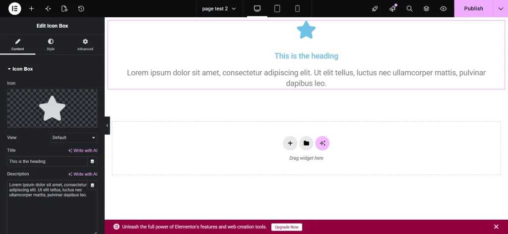
Drag the Icon Box widget from the Elementor panel onto the canvas. The Content tab opens on the left. The Icon field provides access to Elementor’s Font Awesome library, covering thousands of vector icons. Custom SVG uploads are worth using for brand-specific icons because SVGs scale perfectly at any resolution without adding image file weight. Always choose an icon that directly reflects the accompanying text. A generic checkmark beside “Advanced Analytics” communicates less than a chart icon does.
Title and Description fields reward brevity. The title works as a clear label, not a sentence. The description provides the necessary context in a maximum of two to three lines. Longer descriptions signal that the content belongs on a dedicated page rather than inside a widget designed for scanning. The Link field makes the entire box clickable, directing visitors to a page with the full detail when they want it.
Icon position controls where the icon sits relative to the text. Top placement stacks the icon above the title and description, which works well in multi-column grid layouts and scales cleanly to mobile. Left placement creates a horizontal layout that suits process steps and feature lists with longer descriptions.
Configuring the Icon Box: Style Tab
The Style tab controls every visual aspect of the widget. Icon size, primary color, hover color, and spacing from the text all live here. Consistent icon sizing across all boxes in a section is critical. Varied sizes create visual instability that undermines the grid structure the layout depends on. Pull icon colors from the global palette to maintain brand consistency automatically across the entire site. The Box section adds background color, border, padding, and box shadow to the container. A subtle shadow on hover creates interactive depth that rewards visitor engagement without adding visual noise at rest.
What the Image Box Widget Does and When to Use It

The Image Box widget combines a photograph or graphic with a title and description in the same structured format as the Icon Box. Where the Icon Box uses abstraction to communicate, the Image Box uses concrete visuals to create context and emotional resonance. Research from the Nielsen Norman Group consistently shows that users process images significantly faster than text, and real photographs of people, products, and places carry authenticity that illustrated icons cannot replicate. Their findings on photos and usability detail how concrete imagery improves comprehension and engagement across a range of content types.
Team member profiles belong in image boxes because a headshot beside a name and role communicates humanity and credibility instantly. Product showcases benefit from image boxes because the product photograph carries the primary message before the description adds context. Portfolio thumbnails linking to case studies, client testimonials paired with client photos, and service categories illustrated with real project photography all suit the Image Box’s strengths.
Configuring the Image Box: Content Tab
The Content tab mirrors the Icon Box structure with one important addition: image size selection. Elementor provides thumbnail, medium, and full-size options for each image. Smaller display sizes reduce page load time without sacrificing visual quality at typical display dimensions. Pre-optimizing images before uploading produces better results than relying on Elementor’s resizing alone. A 1200px-wide image displayed at 400px still carries the full file weight of the larger version unless it was resized before upload.
The Title and Description fields follow the same brevity principle as the Icon Box. The image carries the visual weight. Text provides the label and context. As the Harvard Business Review notes, pictures make messages more memorable, which means the image and text should reinforce each other rather than repeat the same information in different formats.
Configuring the Image Box: Style Tab
Image width, opacity, border radius, border, and hover effects all sit in the Style tab. Border radius softens the image corners, which works well for team member profiles and creates a less formal, more approachable visual tone. Box shadow on the image adds depth that separates it from flat background sections. Hover opacity effects provide subtle interactive feedback that communicates clickability without requiring a visible button. Always verify sufficient contrast between the description text color and the box background. Readability failures at this level undermine the credibility the high-quality image is meant to establish.
Icon Box vs Image Box: Choosing the Right Widget
| Scenario | Use Icon Box | Use Image Box |
|---|---|---|
| Content type | Abstract concepts, features, steps | Real people, products, projects |
| Visual consistency | High, icons stay uniform | Depends on photo consistency |
| Page load impact | Minimal, SVG icons are lightweight | Higher, requires image optimization |
| Emotional resonance | Low to medium | High |
| Best section type | Features, services, process flows | Team, portfolio, testimonials |
Managing the layout structure of sections built with either widget is easier with the Elementor Navigator open alongside the canvas. Complex sections with multiple boxes across several containers benefit from the Navigator’s clear hierarchy view, which makes selecting, reordering, and troubleshooting individual elements significantly faster. For spacing and gap control inside Flexbox container layouts, the Elementor Flexbox Containers guide covers precise alignment techniques that apply directly to both widget types.
Common Mistakes That Undermine Both Widgets
Inconsistent styling across boxes in the same section is the most visible mistake. Icon sizes, title font weights, description line heights, and box padding that differ between items in the same grid create visual instability that visitors register as unprofessional without always identifying why. Setting global typography and colors before building any section with these widgets prevents the inconsistency from appearing in the first place.
Overloading description text ranks second. Both widgets are scanning tools, not reading tools. More than three lines of description text in either widget signals content that belongs on a dedicated page. A link field pointing to that page handles the detail without turning the widget into a wall of text.
Irrelevant visuals break trust quietly. An icon that does not clearly relate to its title forces visitors to interpret rather than scan. A generic stock photo beside a team member description where a real headshot belongs signals inauthenticity. The visual and the text should reinforce the same message, not pull in different directions. Accessibility also requires attention: every Image Box needs descriptive alt text on the image, and purely decorative Icon Box icons should be marked to hide from screen readers so assistive technology does not announce meaningless content.
Reusing well-built Icon Box and Image Box sections across multiple pages becomes effortless when saved as templates. The guide on How to Save and Reuse Elementor Templates covers the full process for preserving widget configurations and redeploying them without rebuilding from scratch.
Additional Resources
- WordPress Basics and Installation: The Complete Beginner’s Guide
- Getting Started with Elementor in 2026: The Complete Guide
- How to Use Elementor Flexbox Containers: A Beginner’s Guide
- Elementor Navigator: How to Manage Complex Layouts
- How to Save and Reuse Elementor Templates
- Setting Up Global Colors and Fonts in Elementor
- Adding and Styling Images in Elementor
- 10 Essential Elementor Widgets Every Designer Must Know
- Photos and Usability: Nielsen Norman Group
- Pictures Make Your Message More Memorable: Harvard Business Review
Final Thoughts: Scan First, Read Second
Visitors do not read web pages the way they read books. They scan, identify points of interest, and then decide whether to read further. Both the Icon Box and the Image Box are built for the scanning phase, not the reading phase. Using them correctly means keeping text concise, choosing visuals that communicate before the title does, maintaining consistent styling across every item in a section, and linking to full detail rather than cramming it into the description field. Done that way, both widgets earn their place on every professional Elementor build. If you need to revisit the WordPress foundation beneath all of this, the WordPress basics and installation guide is always the right place to start.