
A computer monitor with a purple background and a keyboard, displayed on a landing page designed with Elementor.

How to Build a High-Converting Landing Page with Elementor in 2026

A few years ago, a client came to me frustrated. Their main website was getting decent traffic but almost no inquiries. The homepage had a navigation menu with eleven items, three rotating banners, and links to every service they offered. Visitors arrived, looked around, and left without doing anything. We built them a dedicated landing page for their primary service: no navigation, one headline, one CTA button, one form. Conversions increased by 340 percent in the first month. The page itself took four hours to build in Elementor. The strategy behind it took four conversations to clarify.

Creating a simple landing page with Elementor is one of the highest-return skills a marketer or web designer can develop. The technical side is straightforward. The strategic side is where most pages fail before a single widget gets placed. This guide covers both, from the pre-design decisions that determine whether a landing page converts to the Elementor-specific steps that bring it to life. If the Elementor editor is still new territory, the Getting Started with Elementor guide covers the interface foundation worth having first. For the WordPress layer beneath everything here, the WordPress basics and installation guide is where that foundation starts.

Why Landing Pages Outperform Regular Website Pages

Ultimate guide to landing pages using Elementor, showcasing design tips and best practices for effective conversions.

A homepage serves many audiences and many purposes. A landing page serves one audience and one purpose. That focus is the source of its conversion advantage. Industry benchmarks put average landing page conversion rates between 2 and 5 percent. Top performers reach 10 to 20 percent with rigorous optimization. Standard website pages rarely exceed 1 percent. The difference is not design quality. It is the elimination of competing choices.

Every navigation link, related article suggestion, and secondary CTA on a regular page gives visitors a reason not to complete the primary action. A landing page removes those exits deliberately. The user arrives, reads, and either converts or leaves. That simplicity forces clarity on the designer, which produces a better page almost every time.

Strategy Before Design: The Four Questions That Drive Conversions

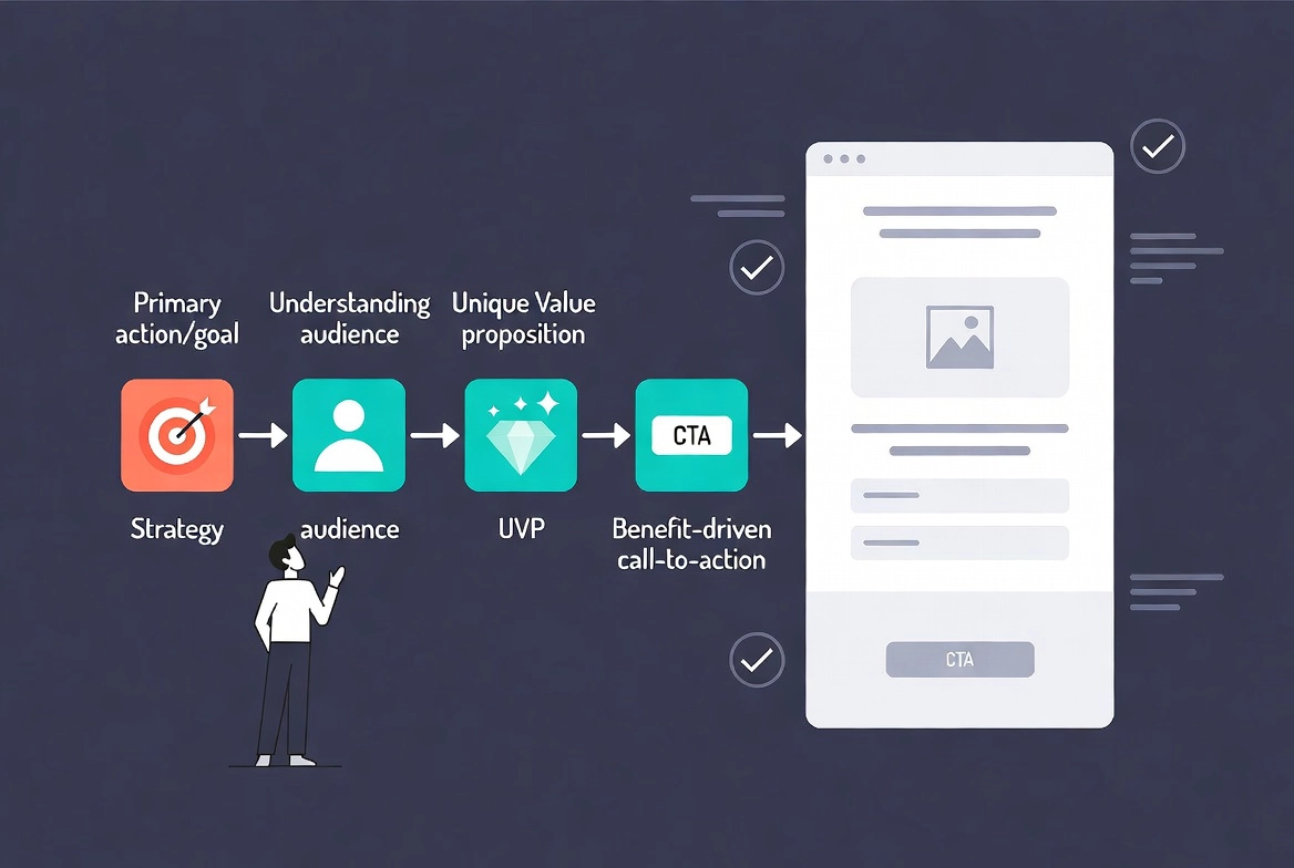
Placing widgets before answering four strategic questions produces a page that looks polished and performs poorly. Every element on a landing page should trace back to a clear answer to each of these.

The first question is what singular action the visitor must take. One landing page, one goal. A form submission and a purchase on the same page split attention and reduce both. The second question is who the visitor is. Their language, their objections, their motivations, and what they already know about the offer all determine copy tone and content depth. The third question is what unique value the offer provides. This is the Unique Selling Proposition, and it needs to appear in the headline, not buried three paragraphs down. The fourth question is what the CTA button should say. “Download Now” describes an action. “Get My Free Guide” describes a benefit. Benefit-driven CTA language consistently outperforms action-only language in split tests.

Sketching a rough wireframe after answering these questions saves significant time in the editor. Knowing where the headline, image, form, and CTA go before opening Elementor turns layout decisions into execution rather than discovery.

Setting Up the Elementor Environment for a Landing Page

From the WordPress dashboard, install and activate Elementor through Plugins then Add New. Create a new page under Pages then Add New, give it a descriptive internal title, and click Edit with Elementor to launch the editor. For a true landing page experience, click the gear icon in the bottom-left corner of the editor, find Page Layout, and select Elementor Canvas. This removes the theme header, footer, and sidebar entirely, leaving a clean slate with no distractions for the visitor.

If the page needs a minimal branded header with a logo or phone number, Elementor Full Width keeps the theme’s header and footer while still giving full-width layout control over the page body. For most lead generation landing pages, Canvas is the right choice. If you are still deciding between Elementor Free and Pro, the Elementor Free vs Pro comparison covers which features matter for landing page builds specifically.

Building the Core Landing Page Structure

A high-converting landing page follows a proven structural sequence. Each section earns the next by building trust and momentum toward the conversion point.

The Hero Section: Your Most Important Real Estate

The hero section sits above the fold and determines whether visitors stay or leave. Add a single-column container to the canvas. Drag a Heading widget in and write the primary headline directly from the USP identified in the strategy phase. Below it, a Text Editor widget carries the sub-headline or a single clarifying sentence. An Image or Video widget adds visual context. The Button widget for the primary CTA goes here with high-contrast color, benefit-driven text, and enough padding to make it easy to tap on mobile.

Everything in the hero section should answer the visitor’s first question: “Am I in the right place?” If the headline, visual, and CTA do not answer that within three seconds, the session ends before the page even begins to work.

Value Proposition and Features Section

Below the hero, a two- or three-column container holds Icon Box or Image Box widgets that present the core benefits. Lead with outcomes, not features. “Save three hours per week” lands harder than “automated scheduling.” Each benefit point should connect directly to a pain point the target audience identified in the strategy phase.

Social Proof Section

Trust is the primary barrier between interest and conversion. A section dedicated to testimonials, client logos, star ratings, or case study results addresses that barrier directly. Research published by the Harvard Business Review found that customer reviews influence 93 percent of purchasing decisions. The Testimonial widget in Elementor Pro handles this section cleanly. On the free plan, a Text Editor widget for the quote and an Image widget for the client photo or logo achieves the same result.

Secondary CTA and Lead Form Section

Visitors who scroll to the bottom of a page are the most qualified ones. A second CTA section with a short form captures those leads without requiring them to scroll back up. The Form widget in Elementor Pro handles field configuration, submission actions, and integrations directly. For a full breakdown of form setup including SMTP, spam protection, and CRM connections, the guide on Adding a Contact Form to Your Elementor Page covers every setting in detail.

A single-column container at the bottom carries copyright text and links to the privacy policy and terms of service. Both are legal requirements and build trust with visitors who check them before submitting a form. Navigation links do not belong here on a landing page. Every exit point that does not lead to the CTA reduces conversions.

Essential Widgets for Landing Page Construction

Widget Primary Role Pro Required
Heading Primary headline and section titles No
Text Editor Body copy, sub-headlines, policy text No
Button Primary and secondary CTAs No
Image Hero visual, client logos, product shots No
Video Explainer or product demonstration No
Icon Box Feature and benefit lists No
Form Lead capture with integrations Yes
Testimonial Social proof and trust building Yes

For a deeper look at how these widgets work individually and where each fits into broader page builds, the Elementor Widgets Overview guide covers the full library with usage examples.

Designing for Conversion: The Principles That Matter

Visual hierarchy guides the visitor’s eye in the intended sequence. The headline gets the largest treatment. The CTA button gets the highest contrast. Supporting text sits smaller and quieter. Eye-tracking research from the Nielsen Norman Group consistently shows users scan pages in F and Z patterns. Placing the most critical content in the first line of each section and the left side of the layout aligns with how visitors actually read rather than how designers hope they do.

Whitespace is not empty space. It is breathing room that makes the page feel trustworthy and professional. Cramped pages trigger subconscious distrust. Generous padding around key elements increases perceived quality without adding any content at all. Color psychology reinforces message: blue builds trust, green signals safety or growth, red creates urgency. The CTA button color should contrast with the surrounding section, not complement it. Complementary colors create harmony. Contrasting colors create action.

Mobile performance is non-negotiable. Over 60 percent of web traffic comes from mobile devices, and a landing page that breaks on a phone loses more than half its potential conversions before the copy even gets read. Elementor’s responsive controls let you adjust font sizes, image scaling, button placement, and container direction independently at each breakpoint. Always test the live page on a real phone before sending traffic to it. The Responsive Design Basics guide covers every breakpoint decision in a full build context.

Testing and Iterating After Launch

A landing page launch is a starting point, not a finish line. The first version reflects your best assumptions. Data from real visitors reveals which assumptions were wrong.

Set up Google Analytics or an equivalent before the page goes live. Tracking traffic sources, bounce rates, time on page, and conversion events from day one gives you a baseline to measure changes against. Without that baseline, no test result means anything.

A/B testing works on one variable at a time. Test the headline first, because it affects every visitor who lands on the page. A different headline that increases time on page by 20 percent typically improves every metric downstream. After the headline, test the CTA button text, then the hero image, then the form field count. Each test needs enough traffic to reach statistical significance before drawing conclusions. A small but consistent improvement compounds into substantial revenue gains over time.

High drop-off from the form specifically signals friction in the conversion step. Removing one field and retesting almost always produces a meaningful improvement. The goal is not a complete form. The goal is a submitted one.

Frequently Asked Questions About Creating a Landing Page with Elementor

Do I need Elementor Pro to build a landing page?

No. Elementor Free covers the core structural needs: heading, text, image, button, and icon box widgets all work on the free plan. The Canvas page layout that removes theme headers and footers also works on the free plan. Elementor Pro adds the Form widget for lead capture with CRM integrations, the Testimonial widget, and advanced template features. For a simple landing page with an embedded third-party form, the free version is sufficient.

What is the Elementor Canvas layout and why does it matter for landing pages?

Elementor Canvas removes the theme’s header, footer, and sidebar from the page entirely. This gives visitors no navigation links to click, no related content to explore, and no reason to leave the page without either converting or bouncing. Removing those exit points is the single most impactful structural change that separates a landing page from a regular website page. Access it through the gear icon in the Elementor editor under Page Layout.

How long should a landing page be?

Length should match the complexity of the conversion ask. A newsletter signup needs a headline, two benefit points, and a form field. A high-ticket service purchase needs a full sequence: hero, benefits, social proof, FAQ, and multiple CTAs. The correct length is whatever it takes to answer every objection a visitor has before they feel confident enough to convert. Scroll depth data from analytics reveals where visitors stop reading, which identifies where objections are going unanswered.

How do I track conversions on my Elementor landing page?

The most reliable method is a redirect to a dedicated Thank You page after form submission. Setting up a Google Analytics goal triggered by a visit to the Thank You page URL creates a clean conversion event tied to real submissions. This approach works with any form tool and does not require additional conversion tracking code on the landing page itself. The guide on Adding a Contact Form to Your Elementor Page covers how to configure the redirect inside Elementor’s Actions After Submit panel.

What should I test first on a landing page that is not converting?

Start with the headline. It reaches every visitor who loads the page and determines whether they read anything else. A headline that does not immediately communicate the benefit of the offer produces a high bounce rate regardless of how good the rest of the page is. Rewrite it to lead with the outcome the visitor wants rather than the feature or service being offered. Test that change with enough traffic to reach statistical significance before moving to other elements.

Additional Resources

Final Thoughts: Strategy Converts, Design Supports It

The landing page that converts is not the most visually impressive one. It is the one built around the clearest answer to a specific visitor’s most pressing question. Elementor makes the execution fast. The strategy work that happens before opening the editor is what makes that execution count. Define the goal. Know the audience. Write the headline before placing a single widget. Build the sections in the order a visitor needs to encounter them. Test after launch and let data drive changes rather than assumptions.

Four hours in Elementor and four hours of clear thinking produce a landing page that outperforms a homepage that took four weeks to design. The tools are available. The framework is here. If you need to revisit the WordPress foundation beneath all of this, the WordPress basics and installation guide is always the right place to start.

Author

  • Jordan Reyes, Elementor Web Designer and Digital Media Expert at CreatePressHub

    Jordan Reyes is a web designer from the United States who specializes in Elementor and visual site-building tools. He graduated from Arizona State University with a degree in Digital Media Design, where he learned how design and technology come together to create engaging user experiences.

    Jordan has spent the last five years helping small businesses and beginners turn their ideas into beautiful websites using Elementor’s drag-and-drop simplicity. His tutorials focus on creativity, clarity, and real-world solutions that anyone, no matter their skill level, can apply.
    Outside of design work, Jordan loves sketching, visiting local coffee shops, and supporting the creative community through workshops and online design challenges.
    Languages: English.

Our Newsletter

Get awesome content delivered straight to your inbox.

Related Articles

The Ultimate

WordPress Toolkit

Get FREE access to our toolkit – a collection of WordPress related products and resources that every professional should have!

Leave a Comment

white background featuring a white icon, representing the WordPress Toolkit guide.