
The first hero section I ever built in Elementor looked flat and forgettable. The headline was fine. The button was there. Something felt off, and I could not name it for a week. Then a client sent me a competitor’s site and said, “I want it to feel like that.” The difference was a full-width background image with a semi-transparent dark overlay sitting between the photo and the text. That single technique transformed the visual weight of the section entirely. Background images and overlays are among the most powerful visual tools in Elementor, and most beginners walk past them without realizing what they can do. This guide covers the full setup from adding your first background image through advanced overlay techniques that make hero sections, testimonial blocks, and CTA banners look genuinely professional. If the Elementor editor is still new territory, the Getting Started with Elementor guide covers the interface foundation first. For the WordPress layer underneath everything, the WordPress basics and installation guide are where that foundation starts.
Where Background Settings Live in Elementor

Background settings apply at the container level, not the widget level. Click any container handle and open the Style tab. The Background section sits at the top. Four background type options appear: Classic, Gradient, Video, and Slideshow. Classic handles both solid colors and images. Most hero sections and full-width banners use Classic with an image selected.
Click the image thumbnail inside the Classic background panel. The WordPress media library opens. Upload the image or select an existing one. After selecting, four critical display settings appear below the image preview: Size, Position, Repeat, and Attachment. These four settings determine whether the background looks polished or broken across different screen sizes.
The Four Display Settings That Control Everything
Size controls how the image fills the container. Cover scales the image to fill the entire container width and height without distortion, cropping edges if necessary. This is the correct setting for hero sections and full-width banners in almost every case. Contain fits the entire image inside the container, which often leaves visible gaps at the edges. Auto uses the image’s native dimensions, which produces inconsistent results at different screen sizes. Use Cover for any background where the goal is full visual coverage.
Position sets which part of the image stays centered during cropping. Center Center works for most images. If the focal point of the photo sits to the left or right of center, adjusting Position prevents the subject from getting cropped out on narrower screens. This matters most on mobile, where the container height relative to width changes significantly.
Repeat controls tiling. Set this to No-Repeat for photographs. Tiling a photo background creates an obviously broken look that no styling fix can repair. Repeat is only useful for intentional pattern backgrounds where seamless tiling is the design goal.
Attachment set to Fixed creates a parallax-style effect where the background image stays stationary while the page content scrolls over it. It produces a depth effect that works well on desktop. Disable it for mobile, because fixed attachment backgrounds render poorly on iOS and cause layout issues in Safari. Elementor’s responsive controls let you set Attachment to Scroll specifically at the mobile breakpoint while keeping Fixed on desktop.
Adding a Color Overlay for Text Readability
A background image without an overlay creates a readability problem. Text sitting directly on a photograph competes with every color and edge in the image behind it. An overlay solves this by placing a semi-transparent layer between the image and the content, creating visual separation without hiding the background entirely.
In the Style tab of the container, find the Background Overlay section directly below the main Background panel. Set the overlay type to Classic and choose a color. Dark overlays work for light-colored text. Light overlays work for dark text, though this combination appears less frequently in hero sections. The opacity slider controls transparency. A value between 0.4 and 0.6 is the professional standard for most hero backgrounds. Below 0.4, text starts competing with image details. Above 0.6, the background image loses its visual impact and might as well be a solid color.
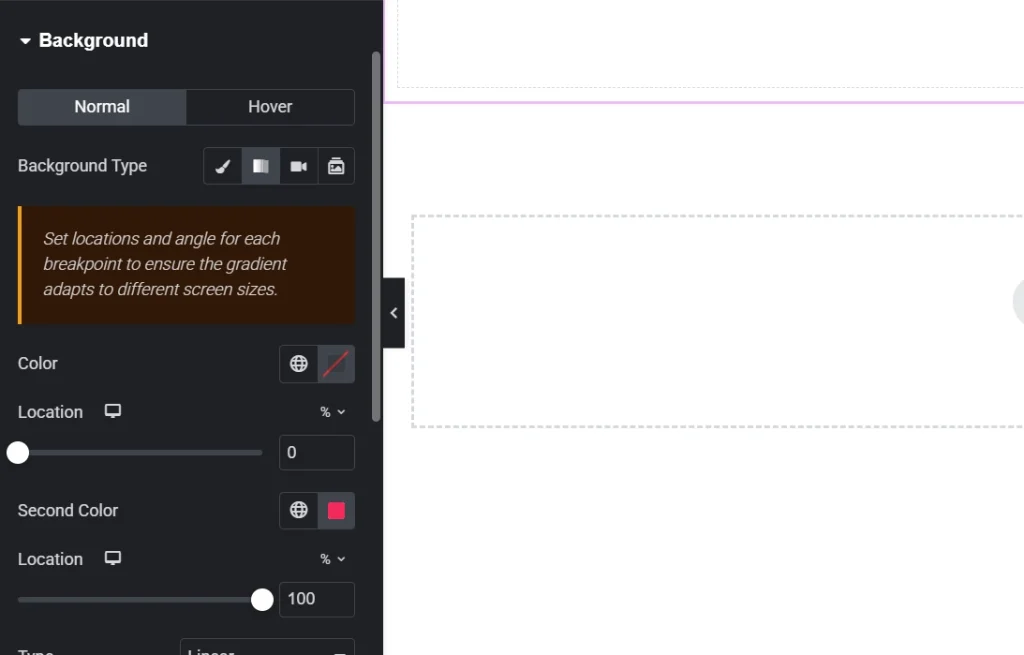
Gradient Overlays for Advanced Visual Effects
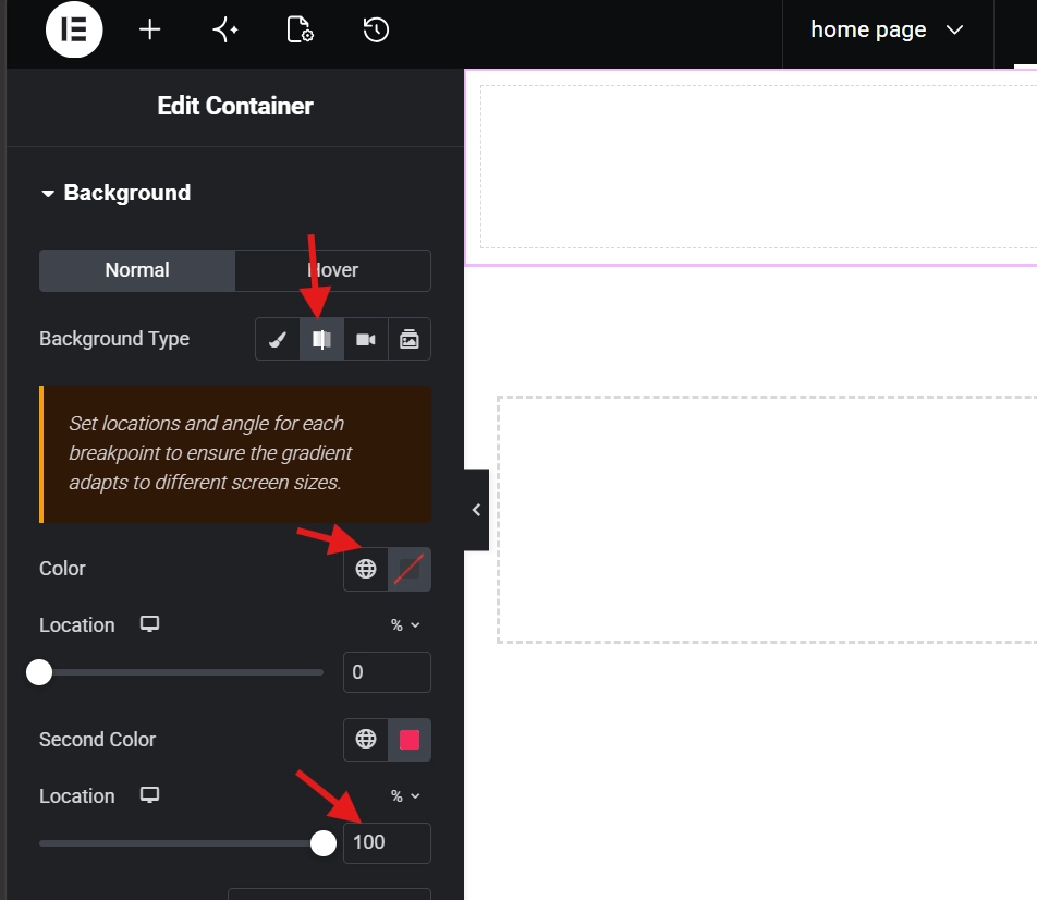
Gradient overlays add directional depth that flat color overlays cannot achieve. Setting the overlay type to Gradient opens controls for start color, end color, angle, and type. A left-to-right gradient that fades from a dark solid on the left to fully transparent on the right lets text sit cleanly on the dark side while the image remains fully visible on the right. This technique works particularly well for split-layout hero sections where content sits on one side and a visual fills the other.
Blend mode in the overlay panel produces more experimental results. Multiply darkens the overlay color where it intersects with light areas of the background image. Overlay intensifies contrast. These settings reward experimentation but require testing across different images since results vary significantly based on the photo’s tonal range.
Background Images on Mobile: The Critical Fixes
| Setting | Desktop | Mobile |
|---|---|---|
| Size | Cover | Cover |
| Attachment | Fixed (parallax) | Scroll (required) |
| Position | Center Center | Adjust to focal point |
| Overlay Opacity | 0.4 to 0.6 | Increase slightly for readability |
Mobile containers are taller relative to their width than desktop containers. This means more of the background image gets cropped vertically, often cutting the focal point of the photo out entirely. Switching to the mobile breakpoint in Elementor and adjusting the position specifically for that screen size fixes the crop problem without affecting the desktop view. For a full walkthrough of responsive breakpoint controls, see the guide on Responsive Design Basics: Making Elementor Sites Mobile-friendly covers every setting in detail.
Performance: Keep Background Images Fast
Background images skip the standard lazy loading that Elementor applies to Image widgets. The browser loads them immediately as part of the container render. Oversized background images directly damage Largest Contentful Paint scores because they are often the largest visual element above the fold. Keep hero background images under 300KB by compressing them in WebP format before uploading. A 4000px-wide image scaled down to 1920px maximum width before compression reduces file size by 60 to 80 percent with no visible quality loss at typical screen sizes.
Final Thoughts: Overlays Make Good Images Work Harder
A great background image with no overlay often looks worse than a mediocre image with the right overlay. The overlay is what makes the content readable, the section feel intentional, and the design feel complete. Start with cover size, center-center position, no-repeat, and a classic overlay at 0.5 opacity. From that baseline, adjust the overlay color to match the brand, test on a real mobile device, and compress the source image before publishing. Those five steps produce a hero section that looks professional on every screen. If you need to revisit the WordPress foundation beneath all of this, the WordPress basics and installation guide is always the right place to start.
Additional Resources
- WordPress Basics and Installation: The Complete Beginner’s Guide
- Getting Started with Elementor in 2026: The Complete Guide
- Responsive Design Basics: Making Elementor Sites Mobile-Friendly
- Adding and Styling Images in Elementor
- Setting Up Global Colors and Fonts in Elementor
- How to Use Elementor Flexbox Containers: A Beginner’s Guide
- How to Build a High-Converting Landing Page with Elementor
- Elementor Best Practices for Beginners