
On one of my early client projects, I made a decision that haunted me for weeks after launch. Rather than configuring global colors at the start, I picked hex codes as I went, trusting myself to remember which shade of blue I had used on the hero button. By the time the site was finished, four slightly different blues had spread across twelve pages. The client noticed immediately. Not one of them could name exactly what was wrong, but the feedback was consistent: something feels off. That “something” was forty minutes of setup I had skipped at the very beginning.
Setting up global colors and fonts in Elementor is the first task on every project I run now, before a single widget touches the canvas. It forms the foundation of a scalable design system, the difference between a site that stays consistent as it grows and one that slowly drifts apart every time someone adds a new page. This guide walks through the full setup process from the Site Settings panel through advanced implementation and long-term maintenance value. If the Elementor interface is still new territory, the Getting Started with Elementor guide covers the foundation you need first. For the WordPress layer underneath everything here, the WordPress basics and installation guide is where that foundation begins.
Why Global Styles Are a Technical Requirement, Not Just a Convenience
Elementor does not simply apply styles to individual widgets. It generates a dynamic CSS stylesheet, and when you activate global settings, the system assigns CSS variables to your components instead of hard-coding hex values and font sizes into every element separately. That distinction carries direct performance consequences. A stylesheet built on CSS variables runs significantly smaller than one packed with repeated declarations, and smaller files deliver faster load times across every page of the site.
The other major benefit is prevention of what experienced designers call design drift. Drift creeps in when a project grows over time and manual styling decisions accumulate small inconsistencies: an H3 at 18px on one page and 20px on another, a button slightly more saturated on the contact page than the homepage. No single difference is dramatic enough to flag immediately, but the cumulative effect makes a site feel unpolished in a way visitors sense even when they cannot identify it specifically. Global styles eliminate drift at the source by creating a single point of truth that every element references. For a broader look at how global styles connect to page structure, the guide on Understanding Elementor Sections, Columns, and Widgets shows how the entire architecture depends on this foundation.
Creating and Managing Global Fonts in Elementor
Before you start styling every heading and paragraph manually, it’s worth setting up your global fonts properly. This quick guide walks you through how to define your typography once and keep your entire site consistent without extra effort.
Building Your Global Color Palette the Right Way
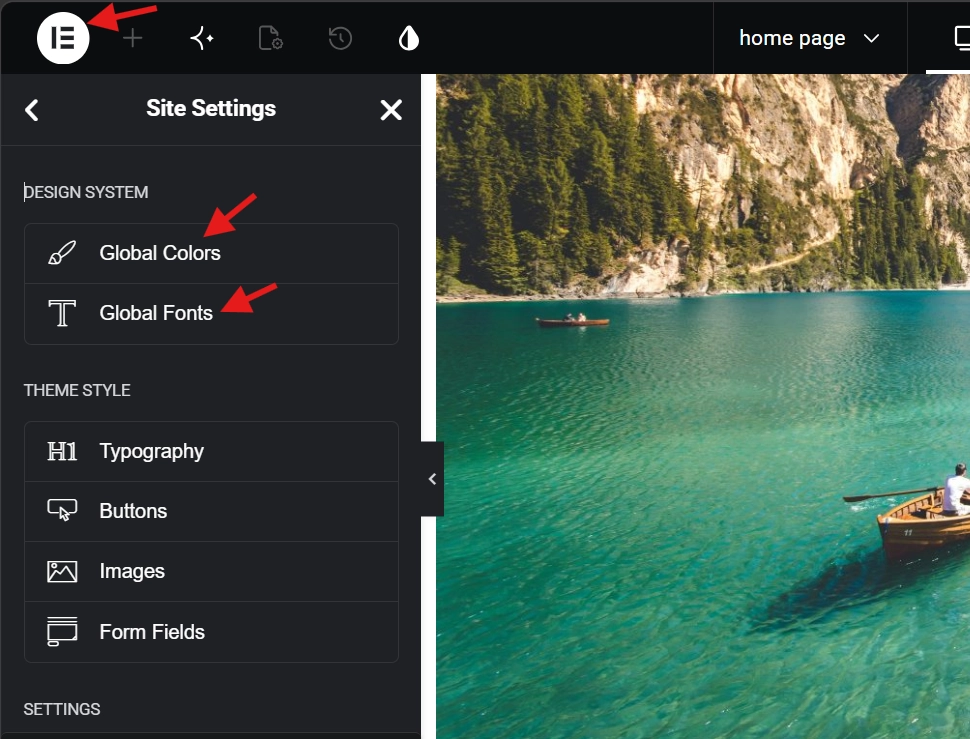
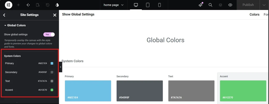
Open any Elementor page and click the hamburger menu in the top-left corner. Navigate to Site Settings and then Global Colors. Four default system slots appear: Primary, Secondary, Text, and Accent. These serve as a starting point, not a ceiling. A professional palette for most sites needs at least eight defined colors to cover the full range of UI needs without reaching for the color picker later.
Function-based naming separates professional palettes from amateur ones. A color called “Dark Blue” tells you what it looks like. “Brand Primary” tells you what it does, and that distinction becomes critical when handing a project to a client or another developer months later. They will know exactly where each color belongs without needing to decode your intentions from a hex code. The table below shows a practical eight-slot palette framework that covers most professional site requirements.
| Color Slot | Function | Example Use |
|---|---|---|
| Brand Primary | Main identity color | Logo, primary buttons, active nav links |
| Brand Secondary | Supporting identity color | Section accents, icon fills, hover states |
| Accent | Call-to-action highlight | CTA buttons, badges, promotional tags |
| Text | Primary readable text | Body copy, headings, navigation labels |
| Text Light | Secondary readable text | Captions, metadata, timestamps |
| Background Light | Subtle section backgrounds | Alternating content rows, card backgrounds |
| Background Dark | High-contrast section backgrounds | Footer, hero overlays, dark mode sections |
| Functional | Status and feedback colors | Form success, error, and warning states |
Run each color through a contrast checker as you build the palette. The Web Content Accessibility Guidelines require a contrast ratio of at least 4.5:1 for normal text against its background. Building compliance into the palette at the global stage means every element that references those variables inherits the correct contrast automatically, rather than requiring individual checks on every widget later.
Configuring Global Typography for the Full Hierarchy
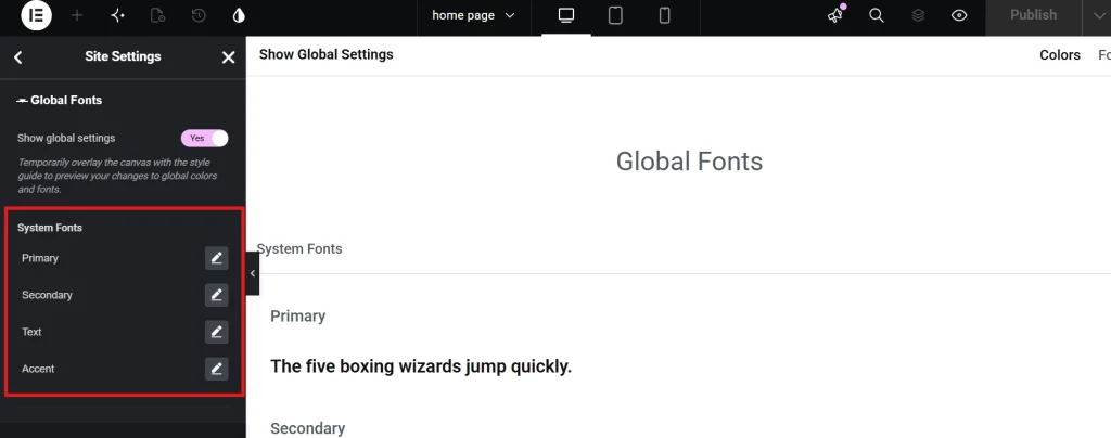
In the Site Settings menu, navigate to Global Fonts. The four default styles cover the basics, but a complete typographic system needs to span the full heading hierarchy from H1 down to small print. Leaving gaps in the hierarchy forces those tags to fall back to browser or theme defaults, which reintroduces exactly the kind of inconsistency that global styles exist to prevent.
Unit selection is where most designers make their first mistake in the typography setup. Pixels are static and ignore browser-level accessibility settings entirely. REM units scale relative to the browser’s root font size, typically 16px by default, so a user who increases their browser font size for visual accessibility gets typography that scales proportionally rather than staying locked at a fixed value. Switching to REM throughout the global fonts setup costs nothing at this stage and delivers a meaningful accessibility benefit across the entire site.
Five typography variables cover most professional sites completely: the Primary Headline for H1, bold and high impact; the Secondary Headline for H2, clearly smaller than H1 but distinct enough to anchor sections; Body Text, where readability takes priority and a size between 16px and 18px is the standard; Accent or Button Text, often uppercase with added letter spacing for clarity at small sizes; and Metadata, a lighter weight style for dates, categories, and supporting information.
Font family count deserves the same discipline as color count. Each font file adds a network request the browser must complete before rendering the page. Two families, one for headings and one for body text, is the professional standard. A third family adds meaningful page weight that can increase Time to First Byte and damage Core Web Vitals scores in measurable ways. The Editing Text and Typography in Elementor guide covers unit selection, variable fonts, and responsive scaling in full detail.
Applying Global Styles: The Globe Icon Discipline
With the palette and typography variables in place, every subsequent styling decision should reference the global system rather than the color picker. In the Style tab of any widget, a globe icon sits next to color and typography settings. Clicking it reveals the global variables you defined. Selecting a global variable rather than a direct hex code keeps the design system intact as the site grows and makes future updates automatic rather than manual.
The Typography section within Site Settings, distinct from Global Fonts, serves a different but equally important function. Global Fonts creates the named style variables. The Typography section maps those variables to specific HTML tags automatically. Setting the H1 tag to use the Primary Headline font style here means every Heading widget on H1 renders correctly from the moment it lands on the canvas, without requiring manual style application on each one individually.
Pro Tip: Any time you reach for the color picker to enter a custom hex code, treat it as a signal to stop. Add the color to the global palette first, then apply it through the globe icon. That discipline is what makes a brand color change a two-minute task rather than a two-day one.
Handling Design Exceptions Without Breaking the System,
Every site eventually produces a design situation the original global setup did not anticipate. A landing page needs a hero headline in white against a dark background, or a promotional section needs a color that appears nowhere else on the site. Elementor allows widget-level overrides of global styles, and they are occasionally the right tool, but frequent overrides signal a gap in the global system rather than a healthy workflow. If overrides exceed roughly 10 percent of all styling decisions, the palette or typography variables need expansion rather than continued workarounds.
Adding the exception to the system is almost always the cleaner resolution. A white headline for dark backgrounds becomes a “Headline Reverse” global font style. A promotional color gets its own named global slot. Keeping exceptions inside the system makes them manageable and reusable on future pages. The same logic applies to form elements. When adding a contact form to an Elementor page, pulling input field and button styles directly from the global typography and color variables keeps the form visually consistent with the rest of the site without any extra manual work.
Performance Gains and Long-Term Maintenance Value

The real return on investing in global styles shows up during the maintenance phase, often months or years after the initial build. A site with 200 blog posts where every subheading carries manual styling requires touching hundreds of individual elements to change a single font weight. Global fonts reduce that same change to one setting update, with the result propagating across every page in milliseconds. This efficiency drives the premium rates agencies charge for sites built on proper design systems rather than ad hoc styling.
Global settings also reduce CSS conflicts because Elementor generates cleaner code when it does not need to output redundant style declarations for every widget separately. Research from Google Fonts Knowledge shows that consistent vertical rhythm and controlled line heights improve reading speed by up to 20 percent. Controlling these variables globally ensures every page on the site delivers that reading experience consistently rather than leaving it to individual styling decisions made page by page over the course of the build.
Frequently Asked Questions About Global Colors and Fonts in Elementor
What happens if I change a global color after the site is already built?
Every element that references the global color variable updates automatically across every page the moment the global setting changes. Elements styled using a direct hex code from the color picker rather than a global variable will not update, which is precisely why the discipline of always selecting global variables from the globe icon matters from the very first widget you style on any project.
How many global colors does a professional site need?
Eight covers most sites effectively, spanning primary and secondary brand colors, an accent for CTAs, two text shades, two background shades, and functional colors for form states. More complex brands with multiple product lines or rich visual identities may need twelve to sixteen slots. Every color in the palette should carry a defined functional purpose. A palette full of colors without clear use cases creates the same organizational problem as having no system at all.
Should I use pixels or REM for global font sizes?
REM is the correct choice throughout. Pixels lock typography at a fixed size and ignore browser-level accessibility settings, meaning users who increase their default font size for visual accessibility see no benefit from that preference on your site. REM scales relative to the browser root font size and respects user settings automatically. Set all global typography in REM units and use Elementor’s device-specific controls to adjust values for tablet and mobile breakpoints where the layout requires it.
What is the difference between Global Fonts and the Typography section in Site Settings?
Global Fonts creates the named font style variables, defining family, size, weight, line height, and letter spacing for each style. The Typography section maps those variables to specific HTML tags automatically. Setting H1 to use the Primary Headline global font in the Typography section means every H1 on the site renders correctly from placement, without requiring manual style selection on each widget. Both sections need configuration for the system to operate at full efficiency.
Can I override a global style for a specific section without breaking the system?
Yes. Elementor supports widget-level overrides of global styles. The professional standard is to reserve overrides for genuine design exceptions that a new global variable cannot solve more cleanly. Frequent overrides are a signal that the global palette or typography system has a gap requiring a new named variable rather than a pattern of individual exceptions scattered across the stylesheet.
Additional Resources
- WordPress Basics and Installation: The Complete Beginner’s Guide
- Getting Started with Elementor in 2026: The Complete Guide
- Editing Text and Typography in Elementor
- Understanding Elementor Sections, Columns, and Widgets
- How to Create Your First Page with Elementor
- Adding a Contact Form to Your Elementor Page
- Responsive Design Basics: Making Elementor Sites Mobile-Friendly
- Elementor Best Practices for Beginners
- How to Save and Reuse Elementor Templates
- Web Content Accessibility Guidelines: Wikipedia
- Google Fonts Knowledge: Typography Research
Final Thoughts: Configure the System Before You Build the Site
The forty minutes spent configuring global colors and fonts at the start of a project pays back every time a color needs updating, every time a font weight needs adjusting, every time a new page needs to match the existing ones without anyone manually checking which hex code appeared three months ago. Site Settings is not a preliminary step before the real work begins. It is the real work, the infrastructure that determines whether the site stays manageable and consistent or slowly fragments under the weight of accumulated manual decisions.
Configure the palette with functional names. Set typography in REM units. Apply global variables through the globe icon on every widget. Add exceptions to the system rather than working around it. These habits cost almost nothing at the start and return enormous value over the life of every project. If you need to revisit the WordPress foundation beneath all of this, the WordPress basics and installation guide is always the right place to start.