Early in my design career, I made a mistake that took me an embarrassingly long time to recognize. Every new project started with me picking fonts I liked the look of, manually styling every heading on every page, and wondering why the finished site always felt slightly inconsistent no matter how much time I spent on it. The pages were not bad. They just never felt fully coherent. The problem turned out to be something I had completely ignored: I had no typography system. I was decorating instead of designing.
Editing text and typography in Elementor is one of those topics that looks simple on the surface and reveals enormous depth the further you go into it. Text accounts for over 90 percent of the information on the average webpage, which means your typography decisions are not aesthetic preferences, they are functional ones. Poor type choices drive up bounce rates, hurt accessibility scores, and quietly undermine trust in the brand. This guide covers the full system, from the core interface controls through global fonts, units, responsive scaling, and accessibility, so that every text decision you make going forward is deliberate and technically sound. If you are still setting up your Elementor environment, the Getting Started with Elementor guide covers the foundation you need before working through this.
Where Typography Lives in the Elementor Interface
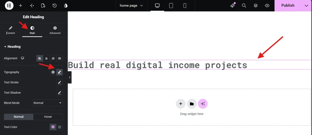
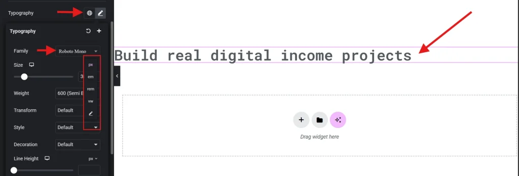
The primary typography controls in Elementor sit inside the Style tab of almost every widget. The Heading widget and the Text Editor widget are the two you will spend the most time inside. Click the pencil icon next to the Typography option in the Style tab and a full panel opens, giving you control over font family, size, weight, transform, style, decoration, line height, and letter spacing.
Each of these settings interacts with the browser in specific ways. Font family, for example, triggers a network request every time the page loads unless the font is already cached or hosted locally on your server. In 2026, that network overhead matters. The professional standard is to limit yourself to two font families per site, one for headings and one for body text. Adding a third or fourth font family for variety is almost never worth the performance cost it introduces.
Font weight deserves the same discipline. Most modern typefaces offer weights ranging from 100 (thin) all the way up to 900 (black). Every weight you load is an additional file the browser has to fetch. The cleanest approach is to load 400 for body text and 700 for headings and avoid loading anything in between unless the design genuinely requires it. Middle weights like 500 or 600 that sit between your already-loaded 400 and 700 add page weight without adding meaningful visual difference for most users.
Writing and Styling Your Content with the Text Editor Widget
Since the vast majority of your blog is made up of body text, getting your typography and spacing right is essential for keeping readers engaged. This tutorial walks you through the core features of the Text Editor widget, including how to format your text, pull in dynamic data, and split heavy paragraphs into clean columns. It even covers fun design elements like drop caps to give your blog posts a polished, professional look that keeps eyes moving down the page.
Choosing the Right Units: PX, REM, EM, and Viewport Units
Unit selection is one of the clearest markers of experience level in web typography. Elementor lets you choose between pixels, EM, REM, and viewport units for font sizing, and defaulting to pixels for everything is a common beginner pattern that creates real accessibility problems.
Pixels are fixed. When a user increases their default browser font size for better visibility, a pixel-based layout ignores that preference entirely and stays the same size. For people with visual impairments who rely on browser-level font scaling, this makes your content harder or impossible to read. REM units solve this cleanly. REM is relative to the root font size of the document, which is typically 16 pixels by default. When a user scales their browser font to 20 pixels, your REM-based typography scales proportionally with it, respecting their accessibility preference while preserving your layout integrity.
EM units are similar to REM but relative to the parent element rather than the root. This creates a compounding effect in nested containers where text can become progressively larger or smaller depending on how deep in the DOM it sits. The practical rule is to use REM for font sizes across the board and reserve EM for padding and margins within tightly scoped components like buttons or callout boxes where relative scaling to the component itself is intentional.
Viewport units, specifically VW, are worth understanding for large display headlines. Setting a font size to 10vw means it always occupies 10 percent of the screen width, which produces dramatic, screen-filling headlines on large monitors without breaking on smaller ones. The catch is that without a minimum size constraint, the same 10vw headline becomes unreadably small on mobile. The CSS clamp() function addresses this elegantly. A value like clamp(2rem, 5vw, 4rem) sets a minimum of 2rem, a preferred size of 5vw that scales fluidly, and a maximum cap of 4rem. One line of code handles the entire responsive scaling range without needing to set individual breakpoints per device.
Pro Tip: You can enter clamp() values directly into the custom size field in Elementor’s typography panel. This gives you fluid, truly responsive typography without touching the breakpoint controls at all.
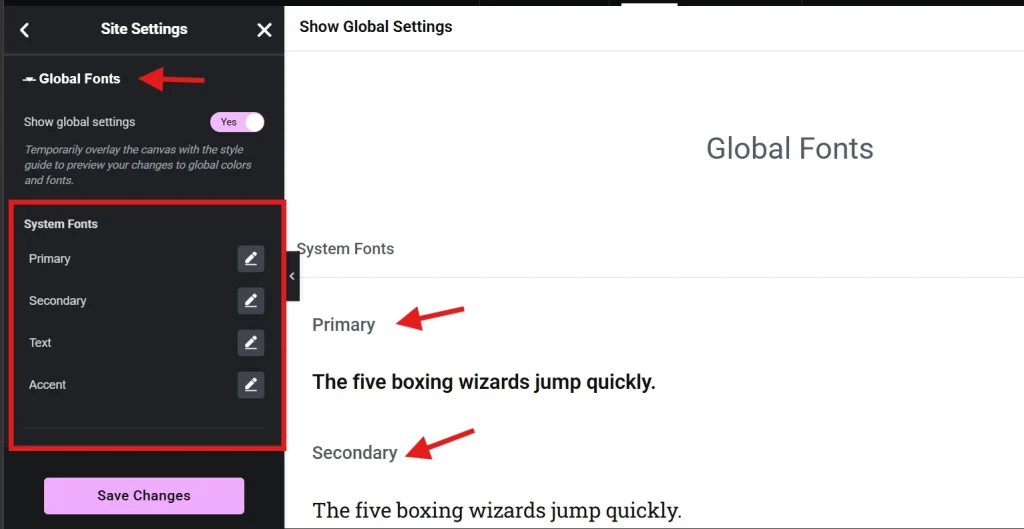
Global Fonts: Building a Single Source of Truth for Your Site
If you are manually changing the font family on individual headings across different pages, you are working against yourself. Elementor’s Site Settings menu includes a Global Fonts section where you define your Primary, Secondary, Text, and Accent fonts once for the entire site. Every widget that pulls from those global definitions updates automatically the moment you change the setting, which means a client requesting a brand font change six months after launch is a two-minute job rather than a two-day one.
Global fonts also prevent what I think of as font drift, the subtle visual inconsistency that develops over time when different pages or sections have been manually tweaked in slightly different ways. Two pages that were styled separately but should look identical will almost always have small discrepancies if they were built with manual styling. Global fonts eliminate that drift by making a single definition authoritative across the entire site.
There is a performance benefit as well. When Elementor knows which fonts are in use globally, it can generate more efficient CSS rather than duplicating font declarations across multiple page-specific stylesheets. For a deeper look at how global styles connect to everything else in your build, the guide on Setting Up Global Colors and Fonts in Elementor covers the full setup process.
The Heading Widget vs. the Text Editor Widget: A Technical Distinction
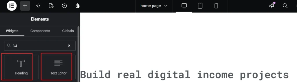
These two widgets look similar and produce visually similar results, but they serve fundamentally different purposes at the HTML level. Getting this wrong quietly damages your SEO and your accessibility score.
The Heading widget outputs semantic HTML heading tags, H1 through H6. These tags are what search engines and screen readers use to understand the structure and hierarchy of your page content. An H1 tells Google and assistive technologies what the primary topic of the page is. H2s are the major subtopics. H3s are subsections within those. Every page should have exactly one H1, and the heading levels below it should follow a logical, nested order without skipping levels. Using a Heading widget simply because you want large text is a common mistake. If you need visually large text that carries no structural meaning, use a Text Editor widget and style the paragraph tag to appear large. The visual result can be identical while the underlying HTML remains semantically correct.
The Text Editor widget is designed for long-form content. It handles multi-line paragraphs, lists, inline formatting, and drop caps more naturally than the Heading widget. One styling habit worth breaking early is inline styling inside the Text Editor, manually selecting individual words and applying colors or sizes directly through the editor toolbar. Inline styles are difficult to manage at scale and override global settings in unpredictable ways. If a specific word needs a different color, use the Span tool or the widget-level color picker in the Style tab rather than inline styling individual characters.
Line Height, Letter Spacing, and the Readability Details That Matter
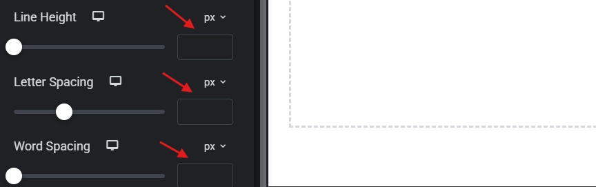
Line height is the vertical space between lines of text, called leading in traditional print design. Browser defaults are often too tight for comfortable reading, and this is one of the small details that separates a site that feels polished from one that feels slightly off without visitors being able to identify why.
For body text, a line height between 1.5 and 1.6 is the established sweet spot. It creates enough breathing room for the eye to track smoothly from the end of one line to the beginning of the next without losing its place. Headings work better at a tighter line height of around 1.1 to 1.2, because heading text is larger and shorter, so the extra spacing that aids body text readability starts to make headings look disconnected and loose when applied at the same ratio.
Letter spacing should be used sparingly and with purpose. A subtle increase of around 0.05em applied to uppercase subheadings gives them a premium, airy quality that reads as intentional and refined. Decreasing letter spacing is almost never the right call unless you are working with a specific display font that has unusually wide default tracking. Over-tightened text looks cluttered and becomes genuinely harder to read at smaller sizes, particularly on mobile screens.
Line length, or measure, is another readability factor that most Elementor users overlook entirely. The ideal reading line is between 50 and 75 characters long. When text stretches across the full width of a large monitor, the reader’s eye has to travel too far to find the start of the next line, which causes fatigue and increases the chance of losing place mid-paragraph. The Max Width setting on your text containers prevents this. Constraining a text block to something like 680px or 720px on large screens keeps line lengths in the comfortable reading range without affecting how the layout looks at smaller breakpoints.
Variable Fonts and Why They Matter for Performance in 2026
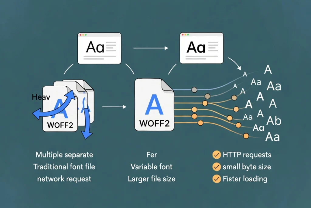
Variable fonts have become the standard for performance-focused web typography. The traditional approach required loading a separate font file for each weight and style variant you needed. Three weights meant three HTTP requests. Variable fonts consolidate every weight, style, and axis into a single file, dramatically reducing both the number of network requests and the total byte size of your typography assets.
Elementor supports custom font uploads, and when using variable fonts you should always use the WOFF2 format. According to Wikipedia’s entry on web fonts, the shift to efficient formats like WOFF2 has been a significant driver of improved mobile web performance over the past several years. Beyond the format itself, hosting fonts locally in Elementor rather than pulling them from Google Fonts delivers an additional performance gain. Loading fonts from an external source requires a DNS lookup for fonts.googleapis.com and a connection to fonts.gstatic.com. Hosting locally eliminates both of those external requests and can reduce your Largest Contentful Paint by 200 to 500 milliseconds on a typical connection.
Accessibility and Contrast: Typography as Inclusion
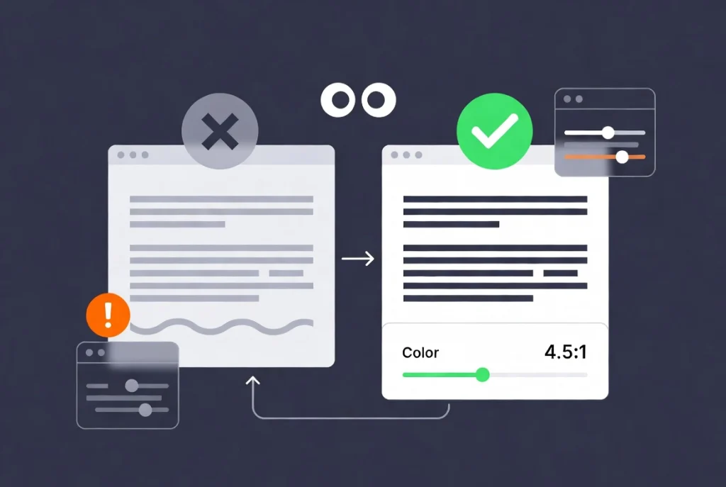
Typography is not only about aesthetics. It is about making sure every visitor can actually read what you have written, regardless of their visual ability or the device they are using. The WCAG 2.2 guidelines require a contrast ratio of at least 4.5:1 between normal body text and its background, and at least 3:1 for large text. Elementor’s color picker displays contrast ratio information to help you stay within these thresholds as you work.
Light gray text on a white background is the most common accessibility failure I see on Elementor sites. It looks clean and minimal in a design mockup on a high-quality monitor. On a phone screen in bright sunlight, or for any visitor with reduced contrast sensitivity, it becomes genuinely unreadable. If your text is not readable, the quality of the font choice is irrelevant.
Text alignment is another accessibility consideration that gets overlooked. Justified alignment, where text is forced to create clean edges on both sides of the column, introduces irregular gaps between words that form visual “rivers” running through paragraphs. These rivers are distracting for all readers and particularly difficult for people with dyslexia. Left-aligned text is the most accessible default because it provides a consistent left edge that the eye can anchor to at the start of every line.
When to Use Custom CSS for Typography Effects
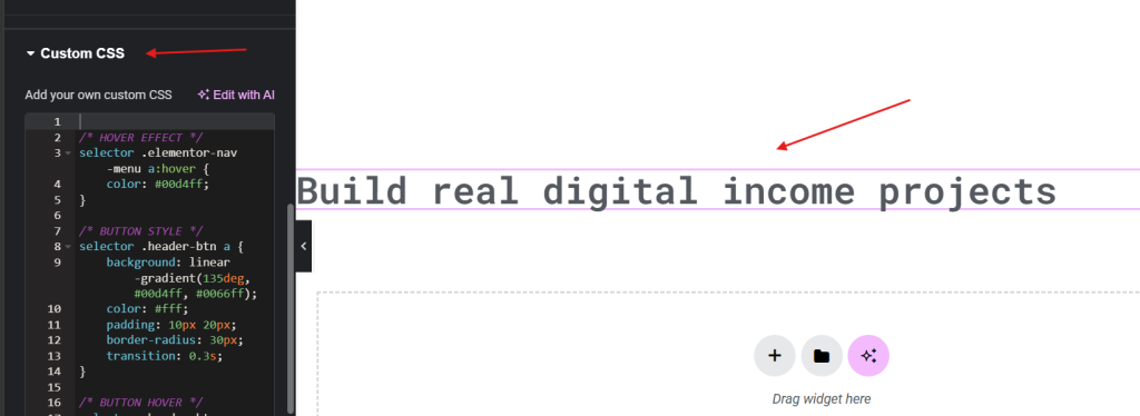
Elementor’s built-in typography controls cover the vast majority of professional use cases, but there are specific effects that require stepping into the Custom CSS tab. The background-clip: text technique, which applies a gradient or image directly to the text characters rather than the background behind them, is one example. It creates visually striking headings without using any image files and has excellent browser support in 2026.
When writing custom CSS for typography, clarity matters as much as correctness. Comment your code so that you or anyone else working on the site six months later understands what each block is doing and why. Custom CSS that solves a specific problem but cannot be understood at a glance becomes technical debt that slows down future maintenance. Write it clean, keep it minimal, and document your reasoning inline.
Frequently Asked Questions About Editing Text and Typography in Elementor
How many fonts should I use on a single Elementor site?
Two is the professional standard. One typeface for headings and one for body text gives you enough visual contrast to create hierarchy without the performance overhead of loading additional font families. A third font is occasionally justified for a specific accent use case like a script font for a pull quote, but anything beyond that typically signals a design system that needs simplification rather than more variety.
What is the difference between REM and EM units in Elementor?
REM is relative to the root font size of the document, which makes it consistent and predictable regardless of where in the DOM an element sits. EM is relative to the font size of the parent element, which means it compounds in nested structures and can produce unintended size changes. For font sizes, REM is almost always the better choice. EM is most useful for component-level spacing like button padding, where sizing relative to the button’s own font size is intentional.
Can I use Google Fonts with Elementor without hurting performance?
You can, but hosting fonts locally is faster. Loading fonts from Google’s servers requires an external DNS lookup and connection that adds latency to your page load, typically 200 to 500 milliseconds on the Largest Contentful Paint metric. Elementor allows you to upload custom font files directly, so downloading your chosen Google Fonts as WOFF2 files and hosting them locally eliminates those external requests entirely while giving you the same typefaces.
Why should I avoid using the Heading widget for decorative large text?
Heading tags carry semantic meaning that search engines and screen readers use to understand your page structure. An H1 signals the primary topic of the page. H2s and H3s define the hierarchy of subtopics. Using a heading tag simply to make text appear large inserts false structural signals into your page that confuse both search crawlers and assistive technologies. For large decorative text with no structural meaning, use the Text Editor widget with a paragraph tag styled to the size you need.
What line height should I use for body text in Elementor?
A line height between 1.5 and 1.6 is the established standard for body text readability. This unitless value means the line height is 1.5 times the current font size, so it scales correctly regardless of the font size you set. For headings, a tighter value of 1.1 to 1.2 typically looks more intentional and avoids the disconnected appearance that comes from applying body text line height ratios to large display text.
How do I make my typography responsive without setting every breakpoint manually?
Use the CSS clamp() function in Elementor’s custom size field. A value like clamp(1.5rem, 4vw, 3rem) sets a minimum size of 1.5rem, a fluid preferred size of 4vw that scales with the viewport, and a maximum cap of 3rem. This single value handles the entire range from mobile to large desktop without needing separate font size settings at each breakpoint. It is the most efficient way to achieve truly fluid typography in Elementor.
Additional Resources
- WordPress Basics and Installation: The Complete Beginner’s Guide
- Getting Started with Elementor in 2026: The Complete Guide
- Setting Up Global Colors and Fonts in Elementor
- Understanding Elementor Sections, Columns, and Widgets
- How to Create Your First Page with Elementor
- Responsive Design Basics: Making Elementor Sites Mobile-Friendly
- Elementor Best Practices for Beginners
- Elementor Interface Tour: Understanding the Editor Panel
- WCAG 2.2 Accessibility Guidelines: W3C
- Web Fonts: Wikipedia
Final Thoughts: Typography Is the Voice of Your Site
Every typographic decision you make in Elementor is a communication decision. The font family signals personality. The size hierarchy guides attention. The line height determines comfort. The contrast ratio determines who can actually read what you wrote. Treating these as afterthoughts produces sites that look almost right but never quite feel authoritative or trustworthy.
The system approach is what makes the difference. Set your global fonts before you build a single page. Choose REM over pixels from the start. Define your heading hierarchy and stick to it. Test your contrast ratios before you publish. These habits take minutes to establish and save hours of corrective work later, while producing sites that perform better in every metric that matters. Typography is the voice of your website, and a clear, consistent, accessible voice is what keeps people reading. If you ever need to step back to the WordPress fundamentals underneath all of this, the WordPress basics and installation guide is always there as your starting point.